
Introduction
Models are at the heart of data science. Data exploration is vital to model development and is particularly important at the start of any data science project. Visualization tools help make the shape of the data more obvious, surface patterns that can easily hide in hundreds of rows of data, and can even assist in the modeling process itself. As Domino seeks to help data scientists accelerate their work, we reached out to AWP Pearson for permission to excerpt the chapter “Real Estate” from the book, Pragmatic AI: An Introduction to Cloud-Based Machine Learning by Noah Gift.
Chapter Introduction: Real Estate
Do you know of any good data sets to explore? This is one of the most asked questions I get as a lecturer or when teaching a workshop. One of my go-to answers is the Zillow real estate data sets: https://www.zillow.com/research/data/. The real estate market in the United States is something that every person living in the country has to deal with, and as a result, it makes for a great topic of conversation about ML.
Exploring Real Estate Values in the United States
Living in the San Francisco Bay Area makes someone think often and long about housing prices. There is a good reason for that. The median home prices in the Bay Area are accelerating at shocking rates. From 2010 to 2017, the median price of a single-family home in San Francisco has gone from approximately $775,000 to $1.5 million. This data will be explored with a Jupyter Notebook [and Domino project]. The entire project, and its data, can be checked out at https://github.com/noahgift/real_estate_ml.
At the beginning of the notebook, several libraries are imported and Pandas is set to display float versus scientific notation.
import pandas as pd
pd.set_option("display.float_format", lambda x: "%.3f" % x)
import numpy as np
import statsmodels.api as sm
import statsmodels.formula.api as smf
import matplotlib.pyplot as plt
import seaborn as sns
sns.set(color_codes=True)

from sklearn.cluster import KMeans
color = sns.color_palette()

from IPython.core.display import display, HTML
display(HTML("{ width:100% !important; }"))
%matplotlib inline
Next, data from Zillow for single-family homes is imported and described.
df.head()
df.describe()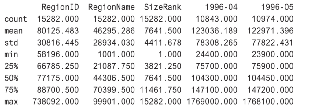
Next, cleanup is done to rename a column and format the column type.
df.rename(columns={"RegionName":"ZipCode"}, inplace=True)
df["ZipCode"]=df["ZipCode"].map(lambda x: "{:.0f}".format(x))df["RegionID"=df["RegionID"].map(lambda x: "{:.0f}".format(x))
df.head()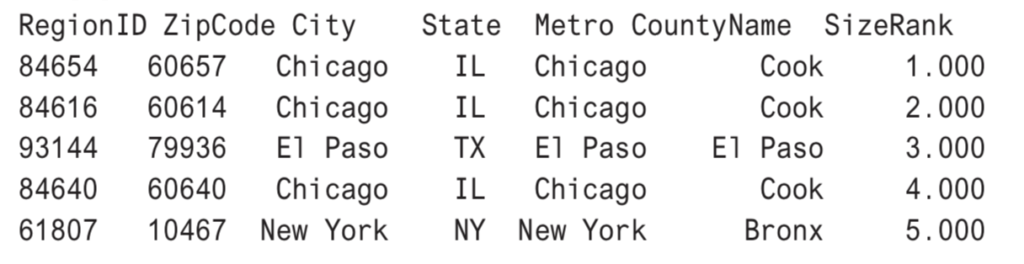
Getting the median values for all of the United States will be helpful for many different types of analysis in this notebook. In the following example, multiple values that match the region or city are aggregated and median calculations are created for them. A new DataFrame is created called df_comparison that will be used with the Plotly library.
median_prices = df.median()
median_prices.tail()
marin_df = df[df["CountyName"] == "Marin"].median()
sf_df = df[df["City"] == "San Francisco"].median()
palo_alto = df[df["City"] == "Palo Alto"].median()
df_comparison = pd.concat([marin_df, sf_df, palo_alto, median_prices], axis=1)
df_comparison.columns = ["Marin County","San Francisco", "Palo Alto", "Median USA"]
Interactive Data Visualization in Python
There are a couple of commonly used interactive data visualization libraries in Python: Plotly and Bokeh. In this chapter, Plotly will be used for data visualization, but Bokeh could also have done similar plots. Plotly is a commercial company that can be used in both offline mode and by exporting to the company website. Plotly also has an open-source Python framework called Dash that can be used for building analytical web applications. Many of the plots in this chapter can be found here.
In this example, a library called Cufflinks is used to make it trivial to plot directly from a Pandas DataFrame to Plotly. Cufflinks is described as a “productivity tool” for Pandas. One of the major strengths of the library is the capability to plot as an almost native feature of Pandas.
import cufflinks as cf
cf.go_offline()
df_comparison.iplot(title="Bay Area MedianSingle Family Home Prices 1996-2017",
    xTitle="Year", ,yTitle="Sales Price",#bestfit=True, bestfit_colors=["pink"],
    #subplots=True,
    shape=(4,1),
    #subplot_titles=True, fill=True,)
    fill=True)
Figure 10.1 shows a view of the plot without interactions turned on. Palo Alto looks like a truly scary place to be entering the housing market as a buyer.
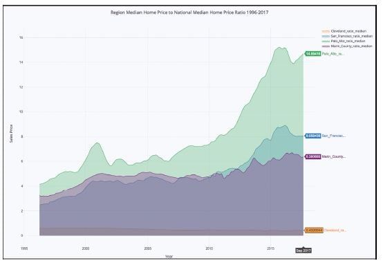
Figure 10.1 Can Palo Alto Grow Exponentially Forever?
In Figure 10.2, the mouse is hovering over December 2009, and it shows a point near the bottom of the last housing crash, with the median housing price in Palo Alto at $1.2 million, the median in San Francisco around $750,000, and the median in the entire United States at $170,000.
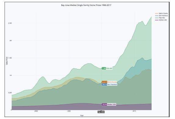
Figure 10.2 Housing Market Bottom in December 2009
By scrolling through the graph, it can be shown that in December 2017, the price in Palo Alto was about $2.7 million, more than double in 8 years. On the other hand, the median home price in rest of the United States has only appreciated about 5 percent. This is definitely worth exploring more.
Clustering on Size Rank and Price
To further explore what is going on, a k-means cluster 3D visualization can be created with both sklearn and Plotly. First, the data is scaled using the MinMaxScaler so outliers don’t skew the results of the clustering.
from sklearn.preprocessing import MinMaxScaler
columns_to_drop = ["RegionID", "ZipCode", "City", "State", "Metro", "CountyName"]
df_numerical = df.dropna()
df_numerical = df_numerical.drop(columns_to_drop, axis=1)
Next, a quick description is done.
df_numerical.describe()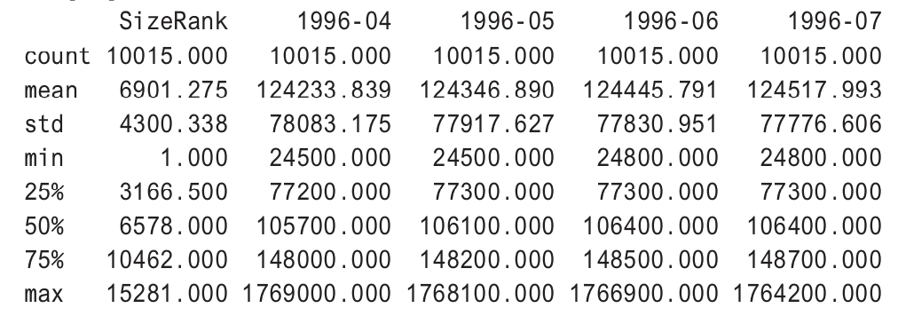
When the cluster is performed after dropping missing values, there are about 10,000 rows.
scaler = MinMaxScaler()
scaled_df = scaler.fit_transform(df_numerical)
kmeans = KMeans(n_clusters=3, random_state=0).fit(scaled_df)
print(len(kmeans.labels_))10015
An appreciation ratio column is added, and the data is cleaned up before visualization.
cluster_df = df.copy(deep=True)
cluster_df.dropna(inplace=True)cluster_df.describe()cluster_df['cluster'] = kmeans.labels_
cluster_df['appreciation_ratio'] =round(cluster_df["2017-09"]/cluster_df["1996-04"],2)
cluster_df['CityZipCodeAppRatio']=cluster_df["City"].map(str) + "-" + cluster_df['ZipCode'] + "-" +
cluster_df["appreciation_ratio"].map(str)cluster_df.head()
Next, Plotly is used in offline mode (i.e., it doesn’t get sent to the Plotly servers), and three axes are graphed: x is the appreciation ratio, y is the year 1996, and z is the year 2017. The clusters are shaded. In Figure 10.3, some patterns stick out instantly. Jersey City has appreciated the most in the last 30 years, going from a low of $142,000 to a high of $1.344 million, a 9x increase.
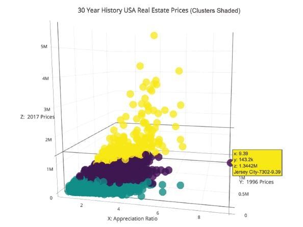
Figure 10.3 What the Heck Is Going on With Jersey City Appreciation?
Some other visible things are a couple of zip codes in Palo Alto. They have also increased about 6 times in value, which is even more amazing considering how expensive the houses were to begin with. In the last 10 years, the rise of startups in Palo Alto, including Facebook, have caused a distorted elevation of pricing, even factoring in the entire Bay Area.
Another interesting visualization would be the appreciation ratio of these same columns to see whether this trend in Palo Alto can be observed further. The code looks similar to the code for Figure 10.3.
from sklearn.neighbors import KNeighborsRegressor
neigh = KNeighborsRegressor(n_neighbors=2)

df_comparison.columns = ["Marin County", "San Francisco", "Palo Alto", "Median USA"]
cleveland = df[df["City"] == "Cleveland"].median()
df_median_compare = pd.DataFrame()
df_median_compare["Cleveland_ratio_median"] = cleveland/df_comparison["Median USA"]
df_median_compare["San_Francisco_ratio_median"] = df_comparison["San Francisco"]/df_comparison["Median USA"]
df_median_compare["Palo_Alto_ratio_median"] = df_comparison["Palo Alto"]/df_comparison["Median USA"]
df_median_compare["Marin_County_ratio_median"] = df_comparison["Marin County"]/df_comparison["Median USA"]
import cufflinks as cf
cf.go_offline()
df_median_compare.iplot(title="Ratio to National Median Region Median Home Price to National Median Home Price Ratio 1996-2017",
xTitle="Year",
yTitle="Ratio to National Median",
#bestfit=True, bestfit_colors=["pink"],
#subplots=True,
shape=(4,1),
#subplot_titles=True,
fill=True)In Figure 10.4, the median appreciation of Palo Alto looks exponential since the housing crash of 2008, yet the rest of the San Francisco Bay Area seems to have be less volatile. A reasonable hypothesis may be that there is a bubble inside the Bay Area, in Palo Alto, that may not be sustainable. Eventually, exponential growth comes to an end.
One more thing to look at would be to look at the rent index and see if there are further patterns to tease out.
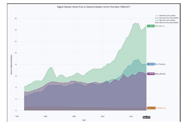
Figure 10.4 Palo Alto Went From Having Home Prices 5 Times Higher Than National Median to 15 Times Higher in About 10 Years
The initial data import is cleaned up and the Metro column is renamed to be a City column.
df_rent = pd.read_csv("../data/City_MedianRentalPrice_Sfr.csv")
df_rent.head()
median_prices_rent = df_rent.median()
df_rent[df_rent["CountyName"] == "Marin"].median()
df_rent.columns
df_rent.rename(columns={"Metro":"City"}, inplace=True)
df_rent.head()
Next, the medians are created in a new DataFrame.
median_prices_rent = df_rent.median()
marin_df = df_rent[df_rent["CountyName"span>] == "Marin"].median()
sf_df = df_rent[df_rent["City"] == "San Francisco].median()
cleveland = df_rent[df_rent["City"] == "Cleveland"].median()
palo_alto = df_rent[df_rent["City"] == "Palo Alto"].median()
df_comparison_rent = pd.concat([marin_df, sf_df, palo_alto, cleveland, median_prices_rent], axis=1)
df_comparison_rent.columns = ["Marin County","San Francisco,"Palo Alto", "Cleveland", "Median USA"]
Finally, Cufflinks is used again to plot the median rents.
import cufflinks as cf
cf.go_offline()
df_comparison_rent.iplot(
title="Median Monthly Rents Single Family Homes",
    xTitle="Year",
    yTitle="Monthly",
    #bestfit=True, bestfit_colors=["pink"],
    #subplots=True,
    shape=(4,1),
    #subplot_titles=True,
    fill=True)
In Figure 10.5, the trends look much less dramatic, partially because the data is spread over a shorter period of time, but this isn’t the whole picture. Although Palo Alto isn’t in this data set, the other cities in the San Francisco Bay Area look much closer to the median rents, whereas Cleveland, Ohio, appears to be about half of the median rent in the United States.
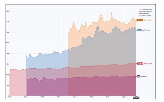
Figure 10.5 Rents in the San Francisco Bay Area since 2011 Have Almost Doubled While the Rest of the US Has Stayed Flat
One final analysis would be to look a similar rent ratio across the United States. In this code, the rent ratio is created with a new empty DataFrame and then inserted into Plotly again.
df_median_rents_ratio = pd.DataFrame()
df_median_rents_ratio["Cleveland_ratio_median"] = df_comparison_rent["Cleveland"]/df_comparison_rent["Median USA"]
df_median_rents_ratio["San_Francisco_ratio_median"] = df_comparison_rent["San Francisco"]/df_comparison_rent["Median USA"]
df_median_rents_ratio["Palo_Alto_ratio_median"] = df_comparison_rent["Palo Alto"]/df_comparison_rent["Median USA"]
df_median_rents_ratio["Marin_County_ratio_median"] = df_comparison_rent["Marin County"]/df_comparison_rent["Median USA"]
import cufflinks as cf
cf.go_offline()
df_median_rents_ratio.iplot(title="Median Monthly Rents Ratios Single Family Homes vs National Median"
xTitle="Year",
xTitle="Year",
yTitle="Rent vs Median Rent USA",
#bestfit=True, bestfit_colors=["pink"],
#subplots=True,
shape=(4,1),
#subplot_titles=True,
fill=True)Figure 10.6 shows a different story from the appreciation ratio. In San Francisco, the median rent is still double the median of the rest of the United States, but nowhere near the 8x increase of the median home price. In looking at the rental data, it may pay to double-check before buying a home in 2018, especially in the Palo Alto area. Renting, even though it is high, may be a much better deal.
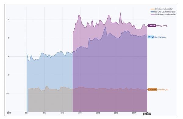
Figure 10.6 Monthly Rents in the San Francisco Bay Area Versus National Median Have Exploded
Summary
In this chapter, a data exploration was performed on a public Zillow data set. The Plotly library was used to create interactive data visualizations in Python. k-means clustering and 3D visualization were used to tease out more information from a relatively simple data set. The findings included the idea that there may have been a housing bubble in the San Francisco Bay Area, specifically Palo Alto, in 2017. It may pay to do further exploration on this data set by creating a classification model of when to sell and when to buy for each region of the United States.
Other future directions to take this sample project is to look at higher-level APIs like ones that House Canary provides. It may be that your organization can build an AI application by using their prediction models as a base, and then layering other AI and ML techniques on top.
Editorial note: small changes have been implemented to increase readability online and reflect the pre-installed components in the complementary Domino project.

Other posts you might be interested in


Subscribe to the Domino Newsletter
Receive data science tips and tutorials from leading Data Science leaders, right to your inbox.
By submitting this form you agree to receive communications from Domino related to products and services in accordance with Domino's privacy policy and may opt-out at anytime.