
Danger of Big Data
Big data is the rage. This could be lots of rows (samples) and few columns (variables) like credit card transaction data, or lots of columns (variables) and few rows (samples) like genomic sequencing in life sciences research. The Curse of Dimensionality, or Large P, Small N, ((P >> N)) problem applies to the latter case of lots of variables measured on a relatively few number of samples.
Each variable in a data set is a dimension with the set of variables defining the space in which the samples fall. Consider a two-dimensional space defined by the height and weight of grade school students. Each student is represented as a point on a plot with the X-axis (dimension) being height and the Y-axis (dimension) being weight. In general, older students are taller and heavier so their points on a plot are more likely to be in the upper right region of the space. Statistical methods for analyzing this two-dimensional data exist. MANOVA, for example, can test if the heights and weights in boys and girls are different. This statistical test is correct because the data are (presumably) bivariate normal.
When there are many variables the Curse of Dimensionality changes the behavior of data and standard statistical methods give the wrong answers. This leads to increased costs from following up on results that are incorrect with expensive and timely experiments and slows down the product development pipelines. In this blog, we show what the changes in behavior of data are in high dimensions. In our next blog, we discuss how we try to avoid these problems in applied data analysis of high-dimensional data.
Data Has Properties
Statistics developed in the last century are based on probability models (distributions). This approach provides an automatic and objective strategy for decision-making under defined assumptions about the data. This model for data analytics has proven highly successful in basic biomedical research and clinical trials.
Unfortunately, this approach fails when the number of variables is much greater than the number of samples (i.e., \(P >> N\)). In high dimensions, the data assumptions needed for statistical testing are not met. In the following we show what happens to data when \(P >> N\) and how it causes incorrect results.
There are four properties of high dimensional data:
- Points move far away from each other in high dimensions.
- Points move far away from the center in high dimensions.
- The distances between all pairs of points become the same.
- The accuracy of any predictive model approaches 100%.
Each property is discussed below with R code so the reader can test it themselves.
Property 1: Points move far away from each other in high dimensions. This means the density of data in local neighborhoods is too sparse to fit distributions.
Consider the height/weight data discussed above. Each student is represented as a vector of length two, \(s_i = (x_{i,1}, x_{i,2})\), where \(x_{i1}\) is the height and \(x_{i2}\) is the weight of student \(i\). The Euclidean distance between two students \(i,j\) over two dimensions \(p = 2\) is \[d_{p = 2}(s_{i}, s_{j}) = \sqrt{(x_{i,1} - x_{j,1})^2 + (x_{i,2} - x_{j,2})^2}.\] Distance is non-decreasing when variables are added, \[d_{p = 3}(s_{i}, s_{j}) = \sqrt{(x_{i,1} - x_{j,1})^2 + (x_{i,2} - x_{j,2})^2 + (x_{i,3} - x_{j,3})^2} \geq d_{p=2}(s_{i}, s_{j}),\] and strictly increasing when the added variables have different values (e.g., \(x_{i3} \neq x_{j3}\)). This result extends to high dimensions, \(d_{p = 1} \leq d_{p=2} \leq d_{p=3} \leq \ldots\).
As the number of dimensions increase to infinity, where the values are different between samples, the distance between pairs of points goes to infinity, i.e., \(\lim_{p\to\infty} d_{P = p}(s_{i}, s_{j}) \rightarrow \infty\). But does this result at the limit have impact at dimensions we see with modern big data? Simulations show that it does.
A simulated data set 100 samples (rows) and 2 covariates \(X,Y\) (columns) was generated from the uniform distribution over the unit square and shown in the following plot.
### This code generates 100 uniformly distributed data
### points over the unit cube used throughout this report
###
set.seed(864729)simData = cbind(X = runif(100), Y = runif(100))
p1 <- ggplot(as.data.frame(simData), aes(x = X, y = Y)) +
      geom_point() + geom_vline(xintercept = .5) +
      geom_hline(yintercept = 0.5) +
      ggtitle('100 Uniform Points on the Unit Square') +
      xlab("X") + ylab("Y") +
      theme_bw()
p1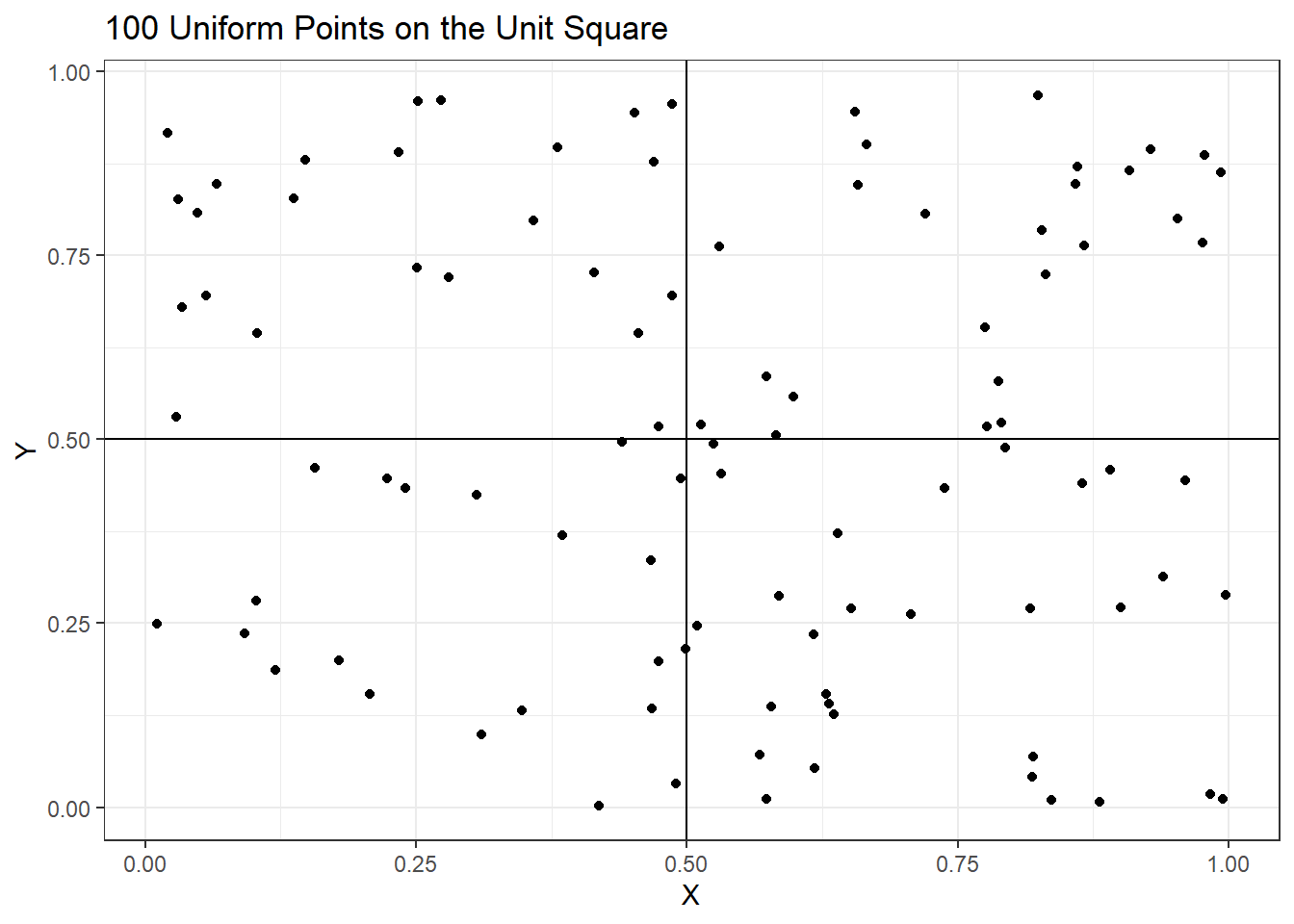
The average pairwise distance between these points is \(0.53\). To see the impact of adding dimensions on average distance between pairs of pints the following code was run. The plot shows the average increases steadily with higher dimensions indicating the points are makes statistical analyses difficult.
### This code adds U(0,1) random variable additional dimensions to
### the simulated data and measures the average pairwise distance
###
simData.average.dist = c('Noise' = 0, 'Iter' = 1, 'Distance' = 0.53)noise = c(8, 98, 998, 9998, 99998)
for(iter in 1:10) {
  for(addedNoise in noise) {
    simData.noise = cbind(simData,
                          matrix(runif(dim(simData)[1]*addedNoise),
                          nrow=dim(simData)[1]))
    simData.dist = dist(simData.noise)
    simData.average.dist = rbind(simData.average.dist,
                                 c('Noise' = addedNoise,
                                   'Iter' = iter,
                                   'Distance' = mean(dist(simData.noise))))
  }
}
simData.dist.agg = aggregate(simData.average.dist[,3],
                             by = list('Dimensions' = simData.average.dist[,1]),
                             mean)
simData.dist.agg$Dimensions = simData.dist.agg$Dimensions + 2
p2 <- ggplot(simData.dist.agg,
             aes(x = Dimensions, y = x)) +
      geom_point() + geom_line() +
      ggtitle('Increase in Distance Between Points') +
      xlab("log(Dimensions)") + ylab("Average Distance") +
      scale_x_log10(breaks =
                    trans_breaks("log10",
                                 function(x) 10^x),
                    labels = trans_format("log10",
                                          math_format(10^.x))) +
      theme_bw()
p2 + annotation_logticks(sides = 'b')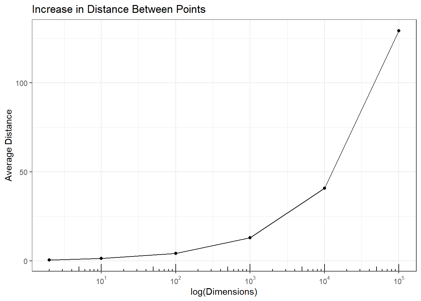
Impact on Analysis: Analysts often cluster \( P >> N \) data. However, sparseness masks clustering and data clusters that exist in low dimensions disappear in higher dimensions. 10 random samples were simulated from \(N(-10,1)\) and 10 from \(N(10,1)\) distributions. The plot shows these data and three cluster analyses for the original data (clear separation of the 2 groups samples \(1-10\) and samples \(11-20\)), with 9 additional noise variables added (some loss of discrimination from increased Height were merging occurs), and 99 additional noise variables added (complete loss of clusters).
The result of clustering when \(P >> N\) is a spurious dendrogram whose clusters are random groupings of the samples.
### this code generates 2 groups of samples from N(-10,1) and N(10,1)
### and runs cluster analysis with and without added noise
###
par(mfrow=c(2,2))
simDataNorm = c(rnorm(10, -10, 1), rnorm(10, 10, 1))
plot(density(simDataNorm), xlab = 'X', main = 'Two Normal Distributions')
grid()
plot(hclust(dist(simDataNorm)), main = 'No Noise', xlab='')
plot(hclust(dist(cbind(simDataNorm,
                       matrix(runif(20*9, -10, 10), ncol=9)))),
     main = '9 Noise Variables', xlab='')
plot(hclust(dist(cbind(simDataNorm,
                       matrix(runif(20*99, -10, 10), ncol=99)))),
     main = '99 Noise Variables', xlab='')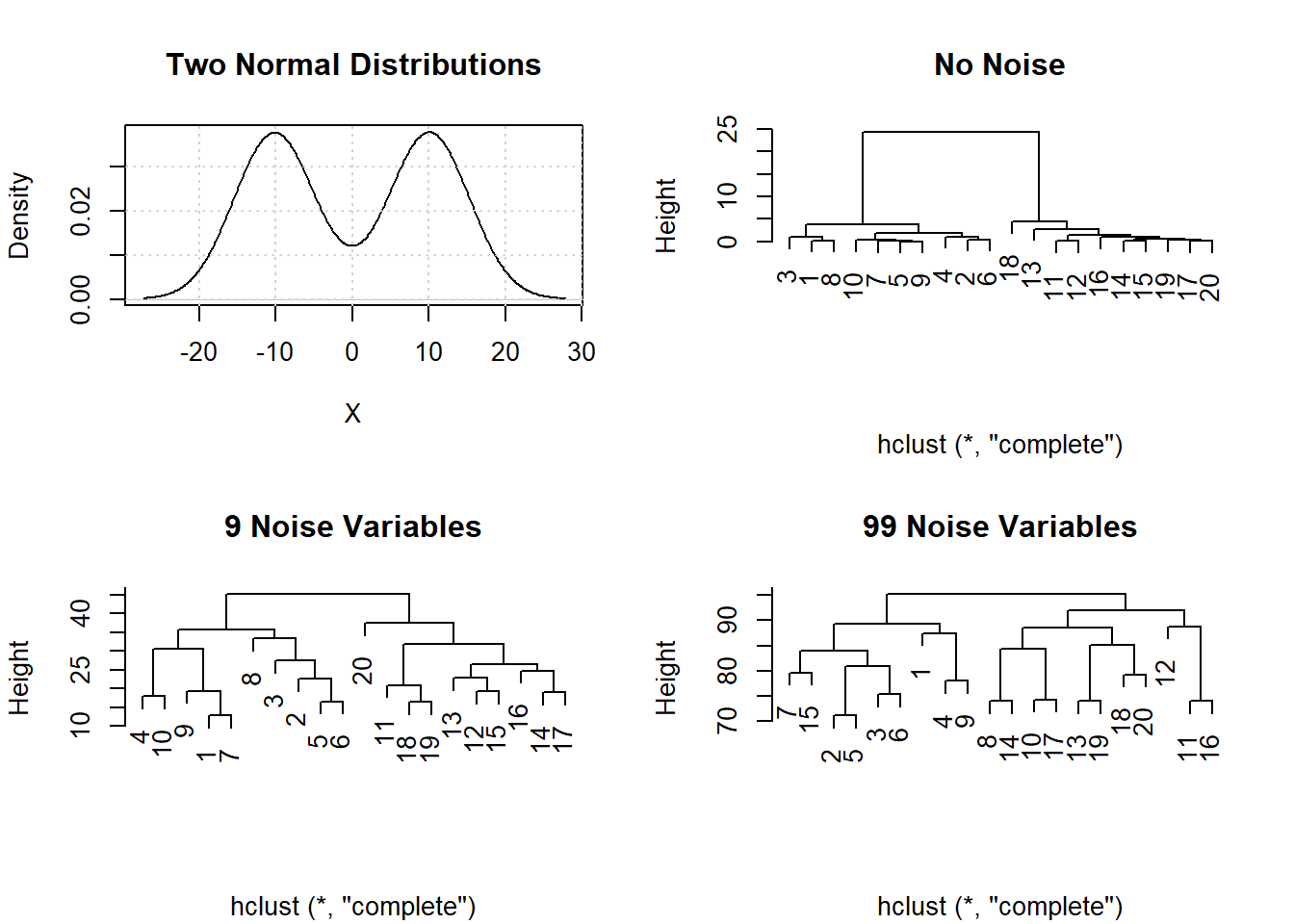
Property 2: Points move far away from the center in high dimensions. This means the data is moving away from the center and heading towards the outer edge of the space.
Points in high dimensions end up on the outer edge or shell of the distribution. Consider independent \(X_i \sim U(0,10)\) random variables or dimensions \(P\) are added to the data, the \(Pr( d(min(x_1, x_2, \ldots), 0) \le \epsilon)\rightarrow 1\) and \(Pr( d(max(x_1, x_2, \ldots), 1) \le \epsilon)\rightarrow 1\). In other words, as more dimensions are added at least one gets within \(\epsilon\) of 0, and at least one gets within \(\epsilon\) of 1.
The table shows the probabilities of 1) falling below 0.001, 2) falling above 0.999, and 3) either falling below 0.001 or falling above 0.999, as more dimensions are added. As expected the probability of falling on the boundary increases with increasing dimensions \(P\).
The second result is the observed center of the data gets further away from the true center. For a multivariate \(U(0,1)\) distribution the Expected center is at \(0.5\) for each dimension. In the simulation below the Observed center (i.e., mean) was estimated and it’s distance to the Expected center calculated. As the dimensions increase \(O-E\) increases indicating the estimated mean is farther from the true mean.
Impact on Analysis: Accurate parameter estimation is needed to fit distributions, perform hypothesis tests, determine power and sample size for experiments, calculate confidence intervals, and numerous other statistical calculations. Since \(O-E\) increases with dimensions the ability to accurately fit distributions, perform hypothesis tests, etc. will deteriorate leading to false conclusions.
### This code calculates the probabilities of being with 0.001 units away from
### the data distribution boundaries, and calculates the difference between the
### observed and expected mean parameter for different dimensions
###
boundaryProb = function(data) {
                                x = t(apply(data, 1, function(a) {c(min(a) <= 0.001, max(a) >= 0.999)}))
                                y = cbind(x, apply(x, 1, max))
                                apply(y, 2, mean)
                              }
nnoise = c(seq(2, 32, by = 4), 100, 1000) - 2
noise = c(0, 8, 98, 998, 9998, 99998)
boundaryProb.results = NULL
for(iter in 1:10) {
  for(addedNoise in noise) {
    simData.noise = cbind(simData,
                          matrix(runif(dim(simData)[1]*addedNoise),
                                 nrow=dim(simData)[1]))
    simData.mean = apply(simData.noise, 2, mean)
    simData.dist.ctr = sqrt(sum((simData.mean -
                                 rep(0.5, length(simData.mean)))^2))
    boundaryProb.results = rbind(boundaryProb.results,
                                 c(2+addedNoise,
                                 boundaryProb(simData.noise),
                                 simData.dist.ctr))
  }
}
colnames(boundaryProb.results) = c('Dimensions', 'Pr(Min. <= 0.001)',
                                   'Pr(Max. >= 0.999)', 'Pr(Either)',
                                   'O - E Dist.')
boundaryProb.results = as.data.frame(boundaryProb.results)
round(aggregate(boundaryProb.results[,2:5],
                by=list('Dimensions' = boundaryProb.results$Dimensions), 'mean'),
      3)
## Dimensions Pr(Min. <= 0.001) Pr(Max. >= 0.999) Pr(Either) O - E Dist.
## 1 2e+00 0.000 0.000 0.000 0.040
## 2 1e+01 0.007 0.008 0.015 0.091
## 3 1e+02 0.091 0.094 0.177 0.290
## 4 1e+03 0.625 0.647 0.868 0.915
## 5 1e+04 0.999 1.000 1.000 2.893
## 6 1e+05 1.000 1.000 1.000 9.134Property 3: The distances between all pairs of points becomes the same. This means that the closest two points have the same distance apart as the two furthest points!
This is the most perplexing result of \(P >> N\) data. Geometrically, 3 points \((i,j,k)\) in 2 dimensions are equidistant when they are vertices of an equilateral triangle. Adding a \(4^{th}\) point, \((i,j,k,l)\), equidistance occurs when the points are vertices of a regular tetrahedron in 3 dimensions. Beyond 4 points my intuition fails and I am limited to think about this empirically to prove equidistance of all points in higher dimensions
All pairwise distances are between the minimum and maximum (range) pairwise distances. If the difference between the maximum and minimum gets smaller than all pairwise distances become more similar, then for all pairs \((i,j)\), \(d(s_i,s_j) \approx d_{max} \approx d_{min}\), and as \(d_{max}-d_{min} \rightarrow 0\), then for \((i,j)\), \(d(s_i,s_j) \rightarrow d_{max} \rightarrow d_{min}\). In other words all pairwise distances become equal. The following plot shows that the in simulation \(d_{max}-d_{min} \rightarrow 0\) as the number of dimensions increases, and therefore by necessity \(d(s_i,s_j) \rightarrow d_{max} \rightarrow d_{min}\).
### This codes added U(0,1) random variable dimensions to the sample data
### and calculates the scaled difference between the max and min.
###
noise = c(2, 10, 100, 1000, 10000, 100000) - 2
simData.average.dist = NULL
for(iter in 1:10) {
  for(addedNoise in noise) {
    simData.noise = cbind(simData,
                          matrix(runif(dim(simData)[1]*addedNoise),
                                 nrow=dim(simData)[1]))
    simData.dist = dist(simData.noise)
    simData.average.dist = rbind(simData.average.dist,
                                 c('Noise' = addedNoise, 'Iter' = iter, summary(simData.dist)))
  }
}
simData.average.agg = aggregate(simData.average.dist[,3:8],
by=list('Noise' = simData.average.dist[,1]), mean)
simData.pairwise.dists = data.frame('Dimensions' = simData.average.agg[,1]+2,
                                    'Dist' = (simData.average.agg[,7] -
                                              simData.average.agg[,2]) /
                                    simData.average.agg[,7])
p3 <- ggplot(simData.pairwise.dists,
      aes(x = Dimensions, y = Dist)) +
      geom_point() + geom_line() +
      ggtitle('Decrease in Scaled Distance Between Minimum and Maximum') +
      xlab("log(Dimensions)") + ylab("Average Distance") +
      scale_x_log10(breaks=trans_breaks("log10",
                                        function(x) 10^x),
                    labels = trans_format("log10",
                                          math_format(10^.x))) +
      theme_bw()
p3 + annotation_logticks(sides = 'b')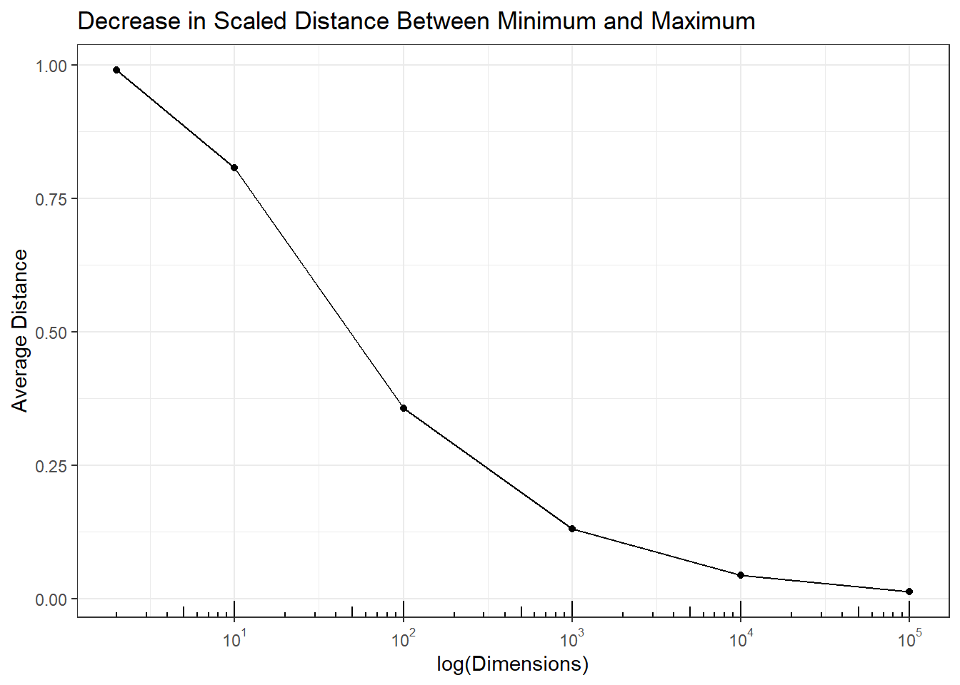
Impact on Analysis: Nearest-neighbor algorithms classify points based on the majority of classes of the nearest points. In this simulation 100 \(N(-5, 1)\) and 100 \(N(5,1)\) data were simulated and \(U(-5,5)\) noise dimensions added. The error for 1 (original 2 group data) dimension and 10 dimensions was 0, but increased as more dimensions were added. At 100,000 dimensions - not unreasonable number of dimensions \(P\) for \(P>>N\) data - nearest-neighbor was wrong on 50% of the cases.
### This codes measures misclassification (error) rate in k = 5 nearest
### neighbor analysis with 100 samples from N(-5, 1) and 100 from N(5, 1)
###
simDataNorm = as.matrix(c(rnorm(100, -5, 1), rnorm(100, 5, 1)))
simDataNorm.train = simDataNorm
simDataNorm.nn = kNN(simDataNorm.train, k=5)
a = apply(simDataNorm.nn$id[1:100,], 1,
          function(a) ifelse(sum(a<101) > 2, 1, 0))
b = apply(simDataNorm.nn$id[101:200,], 1,
          function(a) ifelse(sum(a>100) > 2, 1, 0))
simDataNorm.results = c('Dimension' = 0, 'Iter' = 1,'Error' = 100 - (100*(sum(c(a,b)) / 200)))
for(noise in c(9, 99, 999, 9999, 99999)) {
  for(i in 1:10) {
    simDataNorm.train = as.matrix(cbind(simDataNorm,
                                        matrix(runif(noise*200, -5, 5), ncol=noise)))
    simDataNorm.nn = kNN(simDataNorm.train, k=5)
    a = apply(simDataNorm.nn$id[1:100,], 1,
              function(a) ifelse(sum(a<101) > 2, 1, 0))
    b = apply(simDataNorm.nn$id[101:200,], 1,
              function(a) ifelse(sum(a>100) > 2, 1, 0))
    simDataNorm.results = rbind(simDataNorm.results,
                                c('Dimension' = noise,
                                  'Iter' = i,
                                  'Error' = 100 - (100*(sum(c(a,b)) / 200))))
  }
}
simDataNorm.agg = aggregate(simDataNorm.results[,3],
                            by=list('Dimensions' = simDataNorm.results[,1]),
                            mean)
simDataNorm.agg$Dimensions = simDataNorm.agg$Dimensions + 1
p4 <- ggplot(simDataNorm.agg,
      aes(x = Dimensions, y = x)) +
      geom_point() + geom_line() +
      ggtitle('Increase in Error with Higher Dimensions') +
      xlab("log(Dimensions)") + ylab("Error") +
      scale_x_log10(breaks = trans_breaks("log10",
                                          function(x) 10^x),
                    labels = trans_format("log10",
                                          math_format(10^.x))) +
      theme_bw()
p4 + annotation_logticks(sides = 'b') 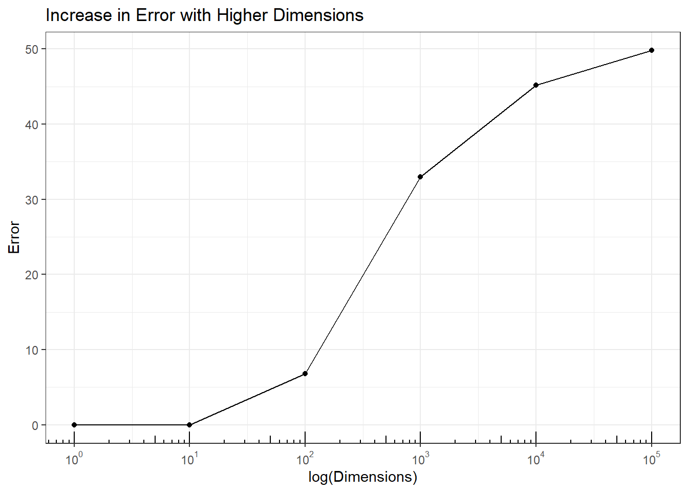
Property 4: The accuracy of any predictive model approaches 100%. This means models can always be found that predict group characteristic with high accuracy.
In \(P >> N\) data where points have moved far apart from each other (Property 1), points are distributed on the outer boundary of the data (Property 2), and all points are equidistant (Property 3), hyperplanes can be found to separate any two or more subsets of data points even when there are no groups in the data. A hyperplane in \(P\) dimensions is a \(P-1\) boundary through the space that divides the space into two sides. These are used to classify points into groups depending on which side of the hyperplane(s) a point falls.
Impact on Analysis: In \(P >> N\) data hyperplanes can be found to classify any characteristic of the samples, even when all the variables are noise. This simulation fits classification trees to predict even and odd rows \((Y)\) for multivariate \(X \sim U(0,1)\) hypercube with different dimensions. There should be no model to accurately predict even and odd rows with random data.
However, the plot shows that the ability to accurately predict even and odd rows increases with dimensions. Therefore, any prediction models fit to high dimensional data may be the result of purely random data. While these models can be verified with test data two things should be remembered. First, a split-data approach where some data is held back for testing still has many common hyperplanes so the test data accuracy may still be very high. There are limited samples in \(P>>N\) data making this difficult. Second, validation from follow-up experiments is expensive and slows down product development. Confirmation studies may show the model is wrong, but it would be preferable not to have needed to run those studies in the first place.
### this code runs recursive partitioning on purely random U(0,1)
### data and calculates how many correctly classified as coming
### from an even or odd row in the data
###
y = rep(c(1,2), 50)
simData.rpart.predict = NULL
for(noise in c(1, 10, 100, 1000, 10000)) {
  for(i in 1:50) {
    simData.y = as.data.frame(cbind(y, matrix(runif(noise*100), ncol=noise)))
    simData.rpart = rpart(as.factor(y) ~ ., data = simData.y)
    simData.rpart.class = table(y, predict(simData.rpart, type='class'))
    simData.rpart.predict = rbind(simData.rpart.predict,
                                  c('Dimension' = noise, 'Iter' = i,
                                    'Error' = (100 - sum(diag(simData.rpart.class)))))
  }
}
simData.rpart.agg = aggregate(simData.rpart.predict[,3],
                              by=list('Dimensions' = simData.rpart.predict[,1]),
                              mean)
p5 <- ggplot(simData.rpart.agg,
      aes(x = Dimensions, y = x)) +
      geom_point() + geom_line() +
      ggtitle('Reduction in Error with Higher Dimensions') +
      xlab("log(Dimensions)") + ylab("Error") +
      scale_x_log10(breaks=trans_breaks("log10",
                                        function(x) 10^x),
                    labels = trans_format("log10",
                                          math_format(10^.x))) +
      theme_bw()
p5 + annotation_logticks(sides = 'b')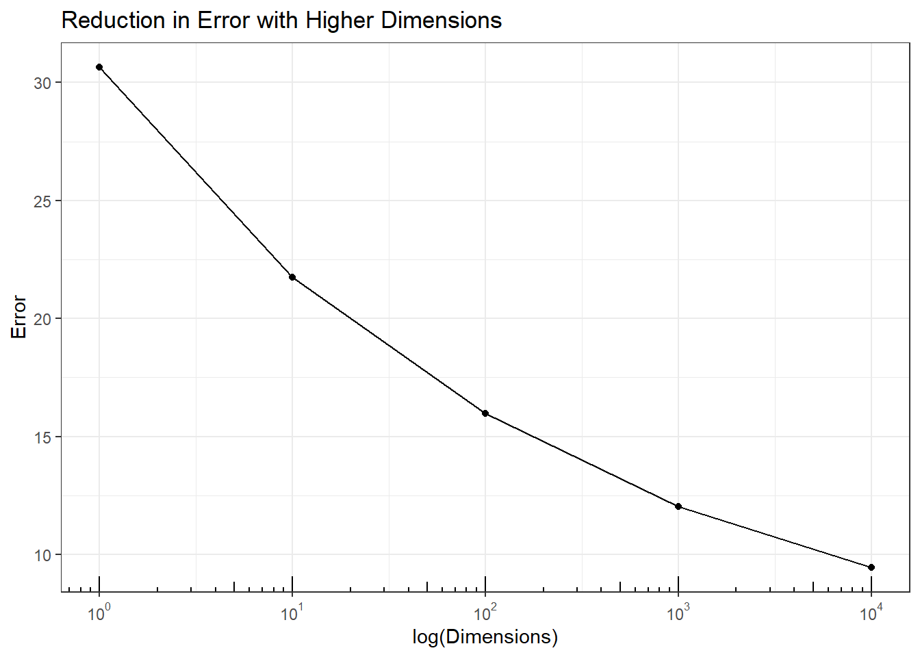
Summary
In this blog 4 properties of \(P >> N\) data were described and simulations used to show their impact on data analysis: as points move away from each other clusters are disrupted and dendrograms give incorrect results; as points move away from the center estimating the mean vector is less accurate; as distance between all pairs of points converge onto the same value nearest-neighbor analysis becomes less accurate;a and as hyperplanes emerge the ability to predict noise to predict random outcomes becomes very accurate.
What makes this most disconcerting is that results will be generated from analyses but it is not possible to know if they are valid or completely spurious due to the Curse of Dimensionality. In our next blog, Analyzing Large P Small N Data - Examples from Microbiome we will discuss approaches we use when analyzing \(P>>N\) data.
About BioRankings
BioRankings harnesses the talent of our innovative statistical analysts and researchers to bring clarity to even the most challenging data analytics problems. While sometimes this is done by applying off the shelf tools, it can often require the fusion of close collaboration, statistical research, and knowledge transfer to deliver tailored solutions and custom statistical software.
Our team focuses on collaboration and works with clients to gain a deep understanding of the data problems that need to be solved and how they will impact the field. Our client list includes Fortune 20 companies, small biotechnology companies, universities, and government laboratories.
Statistical research identifies the current methods used and, when these are inadequate, develops new methods based on advanced mathematics and probability. With collaborators at top medical schools and academic laboratories, BioRankings researchers have authored over 180 publications and received over $3M in National Institutes of Health SBIR (Small Business Innovation Research) funding.
Emphasizing education, we empower our clients to conduct future analyses through planned, intentional knowledge transfer. Researchers build a foundation of understanding of the analytics approaches best for their data types, and analytics staff get support working in new areas.
Finally, our analysts deploy the developed custom statistical compute software in client pipelines and within Domino environments.
Validation, reproducibility, and clarity are values that BioRankings researchers bring to our interactions and software. BioRankings has been delivering custom solutions to clients in medicine, agriculture, and business since 2014.


Bill Shannon is the Co-Founder and Managing Partner of BioRankings. Bill has over 25 years of experience developing analytical methodology for complex and big data in biomedical R&D. In his capacity as a Professor of Biostatistics in Medicine at Washington University School of Medicine in St. Louis, Bill focused on statistical methods grants in emerging areas of medicine, and worked with researchers when there are no known statistical methods for analyzing their study data. Bill acts as a partner with clients and works to communicate results and their implications to both business executives and scientific researchers.
Summary
- Danger of Big Data
- Data Has Properties
- Property 2: Points move far away from the center in high dimensions. This means the data is moving away from the center and heading towards the outer edge of the space.
- Property 4: The accuracy of any predictive model approaches 100%. This means models can always be found that predict group characteristic with high accuracy.
- Summary
Other posts you might be interested in


Subscribe to the Domino Newsletter
Receive data science tips and tutorials from leading Data Science leaders, right to your inbox.
By submitting this form you agree to receive communications from Domino related to products and services in accordance with Domino's privacy policy and may opt-out at anytime.