Subject archive for "visualizations"
Take a look at Domino Code Assist
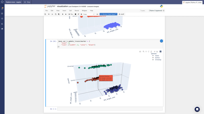
A picture is worth 1000 words, so let's get right into exploring Domino Code Assist (DCA). As I mentioned in my prior blog, with DCA you can import a dataset, make a few data visualizations, and deploy those data visualizations as a Python data app - all through a point-and-click interface. At the end of this, you have a perfectly executable Python or R script that follows the steps that you took in the UI.
By Jack Parmer3 min read

23 Visualizations and When to Use Them
This talk was presented live at PLOTCON 2016 in NYC on November 18, 2016.
By Sheila Doshi1 min read
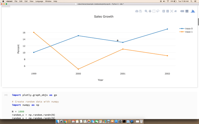
nteract: An open-source, desktop-based, interactive computing application
Today, along with our partners at Plot.ly, we're announcing a significant investment in the open-source nteract project. nteract is a desktop-based, interactive computing application.
By Daniel Chalef2 min read
Visualizing Machine Learning with Plotly and Domino
I recently had the chance to team up with Domino Data Lab to produce a webinar that demonstrated how to use Plotly to create data visualizations inside of Domino notebooks. In this post, I'll share a few of the benefits that I discovered while using Plotly and Domino together.
By Chelsea Douglas5 min read
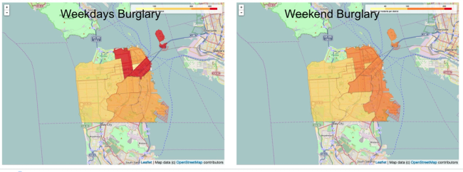
Creating Interactive Crime Maps with Folium
I get very excited about a nice map. But when it comes to creating maps in Python, I have struggled to find the right library in the ever changing jungle of Python libraries. After some research I discovered Folium, which makes it easy to create Leaflet maps in Python.
By roos7 min read
Subscribe to the Domino Newsletter
Receive data science tips and tutorials from leading Data Science leaders, right to your inbox.
By submitting this form you agree to receive communications from Domino related to products and services in accordance with Domino's privacy policy and may opt-out at anytime.