SHAP and LIME Python Libraries: Part 2 - Using SHAP and LIME
Josh Poduska2019-01-14 | 9 min read
This blog post provides insights on how to use the SHAP and LIME Python libraries in practice and how to interpret their output, helping readers prepare to produce model explanations in their own work. If interested in a visual walk-through of this post, then consider attending the webinar.
Introduction
Part 1 of this blog post provides a brief technical introduction to the SHAP and LIME Python libraries, including code and output to highlight a few pros and cons of each library. In Part 2 we explore these libraries in more detail by applying them to a variety of Python models. The goal of Part 2 is to familiarize readers with how to use the libraries in practice and how to interpret their output, helping them prepare to produce model explanations in their own work. We do this with side-by-side code comparisons of SHAP and LIME for four common Python models.
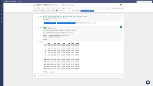
The code below is a subset of a Jupyter notebook I created to walk through examples of SHAP and LIME.
SHAP and LIME Individual Prediction Explainers
First, we load the required Python libraries.
import pandas as pd #for manipulating data
import numpy as np #for manipulating data
import sklearn #for building models
import xgboost as xgb #for building models
import sklearn.ensemble #for building models
from sklearn.model_selection import train_test_split #for creating a hold-out sample
import lime #LIME package
import lime.lime_tabular #the type of LIIME analysis we’ll do
import shap #SHAP package
import time #some of the routines take a while so we monitor the time
import os #needed to use Environment Variables in Domino
import matplotlib.pyplot as plt #for custom graphs at the end
import seaborn as sns #for custom graphs at the end
Next, we load the Boston Housing data, the same dataset we used in Part 1.
X,y = shap.datasets.boston()X_train,X_test,y_train,y_test = train_test_split(X, y, test_size=0.2, random_state=0)Let’s build the models that we’ll use to test SHAP and LIME. We are going to use four models: two gradient boosted tree models, a random forest model and a nearest neighbor model.
# XGBoost
xgb_model = xgb.train({'objective':'reg:linear'}, xgb.DMatrix(X_train, label=y_train))
# GBT from scikit-learn
sk_xgb = sklearn.ensemble.GradientBoostingRegressor()
sk_xgb.fit(X_train, y_train)

# Random Forest
rf = sklearn.ensemble.RandomForestRegressor()rf.fit(X_train, y_train)
# K Nearest Neighbor
knn = sklearn.neighbors.KNeighborsRegressor()knn.fit(X_train, y_train)
The SHAP Python library has the following explainers available: deep (a fast, but approximate, algorithm to compute SHAP values for deep learning models based on the DeepLIFT algorithm); gradient (combines ideas from Integrated Gradients, SHAP and SmoothGrad into a single expected value equation for deep learning models); kernel (a specially weighted local linear regression to estimate SHAP values for any model); linear (compute the exact SHAP values for a linear model with independent features); tree (a fast and exact algorithm to compute SHAP values for trees and ensembles of trees) and sampling (computes SHAP values under the assumption of feature independence -- a good alternative to kernel when you want to use a large background set). The first three of our models can use the tree explainer.
# Tree on XGBoost
explainerXGB = shap.TreeExplainer(xgb_model)
shap_values_XGB_test = explainerXGB.shap_values(X_test)
shap_values_XGB_train = explainerXGB.shap_values(X_train)
# Tree on Scikit GBT
explainerSKGBT = shap.TreeExplainer(sk_xgb)
shap_values_SKGBT_test = explainerSKGBT.shap_values(X_test)
shap_values_SKGBT_train = explainerSKGBT.shap_values(X_train)

# Tree on Random Forest explainer
RF = shap.TreeExplainer(rf)
shap_values_RF_test = explainerRF.shap_values(X_test)
shap_values_RF_train = explainerRF.shap_values(X_train)
As explained in Part 1, the nearest neighbor model does not have an optimized SHAP explainer so we must use the kernel explainer, SHAP’s catch-all that works on any type of model. However, doing that takes over an hour, even on the small Boston Housing dataset. The authors of SHAP recommend summarizing the data first with a K-Means procedure, as shown below.
"""Must use Kernel method on KNN.
    Rather than use the whole training set to estimate expected values, we summarize with
    a set of weighted kmeans, each weighted by the number of points they represent.
    Running without the kmeans took 1 hr 6 mins 7 sec.
    Running with the kmeans took 2 min 47 sec.
    Boston Housing is a very small dataset.
    Running SHAP on models that require Kernel method and have a good amount of data becomes prohibitive"""
X_train_summary = shap.kmeans(X_train, 10)
# using kmeans
t0 = time.time()
explainerKNN = shap.KernelExplainer(knn.predict, X_train_summary)
shap_values_KNN_test = explainerKNN.shap_values(X_test)
shap_values_KNN_train = explainerKNN.shap_values(X_train)
t1 = time.time()
timeit=t1-t0
timeit
Now that we have the models and the SHAP explainers built, I find it helpful to put all the SHAP values into dataframes for later use.
# XGBoost
df_shap_XGB_test = pd.DataFrame(shap_values_XGB_test, columns=X_test.columns.values)
df_shap_XGB_train = pd.DataFrame(shap_values_XGB_train, columns=X_train.columns.values)
# Scikit GBT
df_shap_SKGBT_test = pd.DataFrame(shap_values_SKGBT_test, columns=X_test.columns.values)
df_shap_SKGBT_train = pd.DataFrame(shap_values_SKGBT_train, columns=X_train.columns.values)
# Random Forest
df_shap_RF_test = pd.DataFrame(shap_values_RF_test, columns=X_test.columns.values)
df_shap_RF_train = pd.DataFrame(shap_values_RF_train, columns=X_train.columns.values)
# KNN
df_shap_KNN_test = pd.DataFrame(shap_values_KNN_test, columns=X_test.columns.values)
df_shap_KNN_train = pd.DataFrame(shap_values_KNN_train, columns=X_train.columns.values)
That concludes the necessary setup for the SHAP explainers. Setting up LIME explainers is quite a bit easier, with only one explainer that is then applied to each model individually.
# if a feature has 10 or less unique values then treat it as categorical
categorical_features = np.argwhere(np.array([len(set(X_train.values[:,x]))
for x in range(X_train.values.shape[1])]) <= 10).flatten()
    # LIME has one explainer for all models
    explainer = lime.lime_tabular.LimeTabularExplainer(X_train.values
        feature_names=X_train.columns.values.tolist(),
        class_names=['price'],
        categorical_features=categorical_features,
        verbose=True, mode='regression')
OK, now it’s time to start explaining predictions from these models. To keep it simple, I choose to explain the first record in the test set for each model using SHAP and LIME.
# j will be the record we explain
j = 0
# initialize js for SHAP
shap.initjs()
XGBoost SHAP
Notice the use of the dataframes we created earlier. The plot below is called a force plot. It shows features contributing to push the prediction from the base value. The base value is the average model output over the training dataset we passed. Features pushing the prediction higher are shown in red. Features pushing it lower appear in blue. The record we are testing from the test set has a higher than average predicted value at 23.03 compared to 21.83. LSTAT (percent lower status of the population) is 7.34 for this record. This pushes the predicted value higher. Unfortunately, the force plot does not tell us exactly how much higher, nor does it tell us how 7.34 compares to the other values of LSTAT. You can get this information from the dataframe of SHAP values, but it is not displayed in the standard output.
shap.force_plot(explainerXGB.expected_value, shap_values_XGB_test[j], X_test.iloc[[j]])
XGBoost LIME
Out-of-the-box LIME cannot handle the requirement of XGBoost to use xgb.DMatrix() on the input data, so the following code throws an error, and we will only use SHAP for the XGBoost library. Potential hacks, including creating your own prediction function, could get LIME to work on this model, but the point is that LIME doesn’t automatically work with the XGBoost library.
expXGB = explainer.explain_instance(X_test.values[j], xgb_model.predict, num_features=5)expXGB.show_in_notebook(show_table=True)Scikit-learn GBT SHAP
shap.force_plot(explainerSKGBT.expected_value, shap_values_SKGBT_test[j], X_test.iloc[[j]])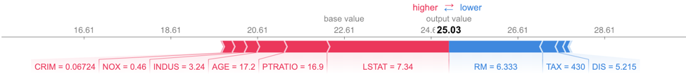
Scikit-learn GBT LIME
LIME works on the Scikit-learn implementation of GBTs. LIME’s output provides a bit more detail than that of SHAP as it specifies a range of feature values that are causing that feature to have its influence. For example, we know that PTRATIO had a positive influence on this predicted house price because its value was below 17.4. SHAP does not provide this information. However, LIME’s feature importance differs from SHAP’s. Since SHAP has a more solid theoretical foundation, most people tend to trust SHAP if LIME and SHAP disagree, especially with the tree and linear SHAP explainers.
expSKGBT = explainer.explain_instance(X_test.values[j], sk_xgb.predict, num_features=5)
expSKGBT.show_in_notebook(show_table=True)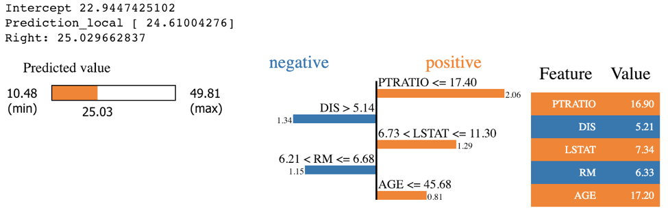
Random Forest SHAP
shap.force_plot(explainerRF.expected_value, shap_values_RF_test[j], X_test.iloc[[j]])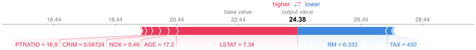
Random Forest LIME
exp = explainer.explain_instance(X_test.values[j], rf.predict, num_features=5)
exp.show_in_notebook(show_table=True)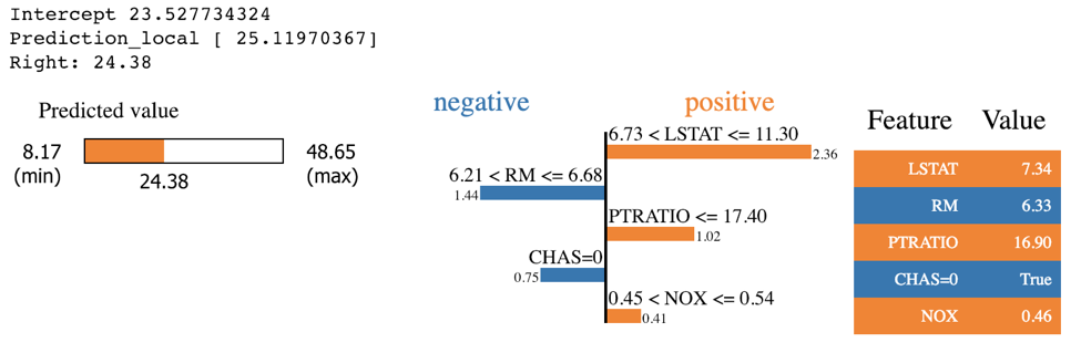
KNN SHAP
shap.force_plot(explainerKNN.expected_value, shap_values_KNN_test[j], X_test.iloc[[j]])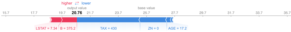
KNN LIME
exp = explainer.explain_instance(X_test.values[j], knn.predict, num_features=5)
exp.show_in_notebook(show_table=True)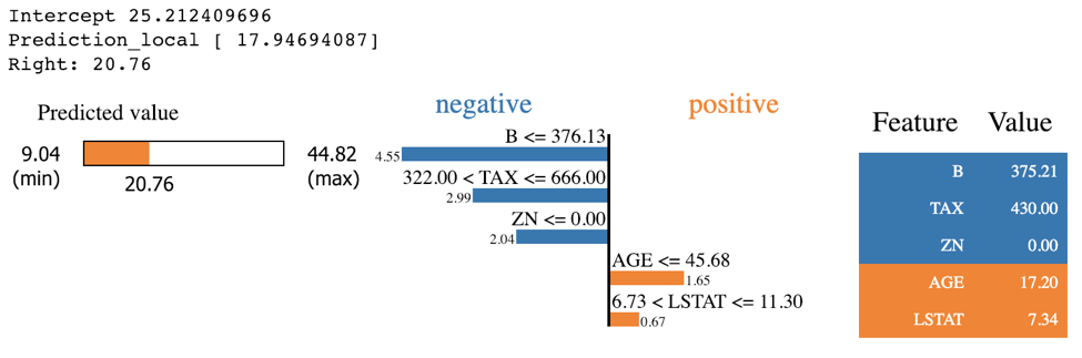
Explainability on a Macro Level with SHAP
The whole idea behind both SHAP and LIME is to provide model interpretability. I find it useful to think of model interpretability in two classes -- local and global. Local interpretability of models consists of providing detailed explanations for why an individual prediction was made. This helps decision makers trust the model and know how to integrate its recommendations with other decision factors. Global interpretability of models entails seeking to understand the overall structure of the model. This is much bigger (and much harder) than explaining a single prediction since it involves making statements about how the model works in general, not just on one prediction. Global interpretability is generally more important to executive sponsors needing to understand the model at a high level, auditors looking to validate model decisions in aggregate, and scientists wanting to verify that the model matches their theoretical understanding of the system being studied.
The graphs in the previous section are examples of local interpretability. While LIME does not offer any graphs for global interpretability, SHAP does. Let’s explore a few of these graphs. I have chosen to use the first model, the one from the XGBoost library, for these graphical examples.
Variable importance graphs are useful tools for understanding the model in a global sense. SHAP provides a theoretically sound method for evaluating variable importance. This is important, given the debate over which of the traditional methods of calculating variable importance is correct and that those methods do not always agree.
shap.summary_plot(shap_values_XGB_train, X_train, plot_type="bar")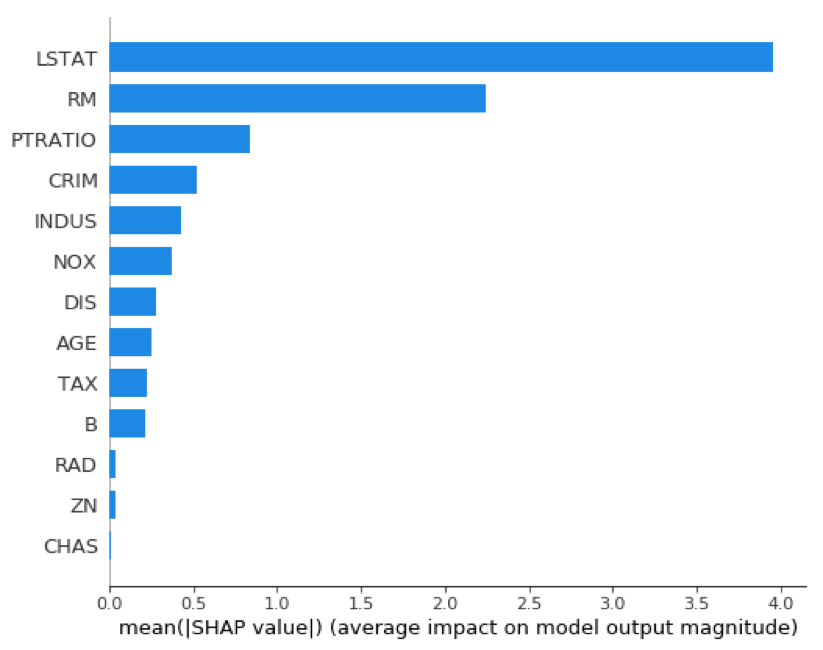
Similar to a variable importance plot, SHAP also offers a summary plot showing the SHAP values for every instance from the training dataset. This can lead to a better understanding of overall patterns and allow discovery of pockets of prediction outliers.
shap.summary_plot(shap_values_XGB_train, X_train)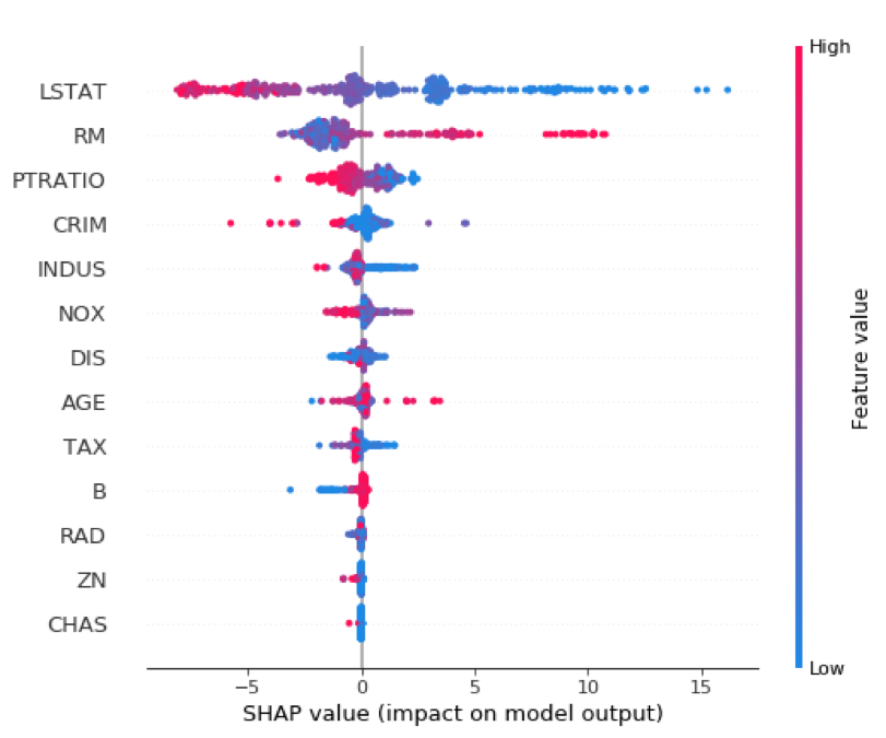
Variable influence or dependency plots have long been a favorite of statisticians for model interpretability. SHAP provides these as well, and I find them quite useful.
shp_plt = shap.dependence_plot("LSTAT", shap_values_XGB_train, X_train)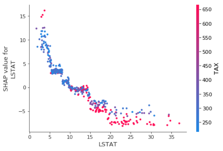
I like these so much, I decided to customize them a bit using matplotlib and seaborn to allow two improvements. First, I highlighted the jth instance with a black dot so we can combine the best of global and local interpretability into one graph. Second, I allowed flexibility with the choice of color-by-variable.
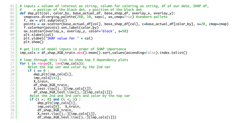
# inputs = column of interest as string, column for coloring as string, df of our data, SHAP df,
# x position of the black dot, y position of the black dot
def dep_plt(col, color_by, base_actual_df, base_shap_df, overlay_x, overlay_y):
    cmap=sns.diverging_palette(260, 10, sep=1, as_cmap=True) #seaborn palette
    f, ax = plt.subplots()
    points = ax.scatter(base_actual_df[col], base_shap_df[col], c=base_actual_df[color_by], s=20, cmap=cmap)
    f.colorbar(points).set_label(color_by)
    ax.scatter(overlay_x, overlay_y, color='black', s=50)
    plt.xlabel(col)
    plt.ylabel("SHAP value for " + col)
    plt.show()
# get list of model inputs in order of SHAP importance
imp_cols = df_shap_XGB_train.abs().mean().sort_values(ascending=False).index.tolist()
# loop through this list to show top 3 dependency plots
for i in range(0, len(imp_cols)):
    #plot the top var and color by the 2nd var
    if i == 0 :
        dep_plt(imp_cols[i], imp_cols[i+1],
        X_train,
        df_shap_XGB_train,
        X_test.iloc[j,:][imp_cols[i]],
        df_shap_XGB_test.iloc[j,:][imp_cols[i]])
        #plot the 2nd and 3rd vars and color by the top var
        if (i >; 0) and (i <; 3) :
            dep_plt(imp_cols[i],
            imp_cols[0],  X_train,
            df_shap_XGB_train,
            X_test.iloc[j,:][imp_cols[i]],
            df_shap_XGB_test.iloc[j,:][imp_cols[i]])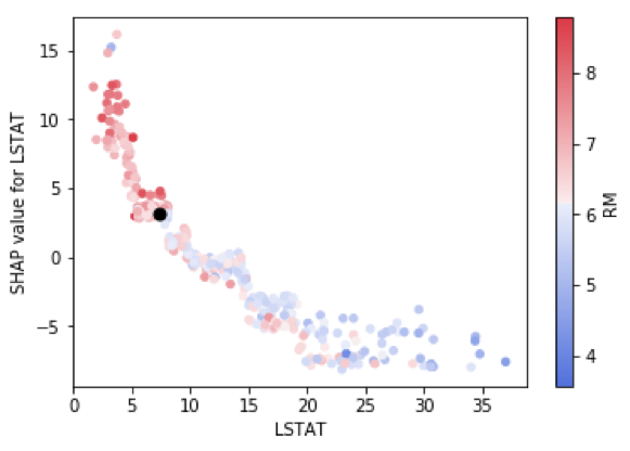
Model explainability remains top of mind for many data scientists and data science leaders today. SHAP and LIME are solid libraries for helping provide these explanations, both on a local and a global level. The need to explain black box models will only increase as time goes on. I believe that in the not too distant future we will find that model explainability combined with model sensitivity/stress testing will become a standard part of data science work and that it will end up owning its own step in most data science life cycles.

Josh Poduska is the Chief Field Data Scientist at Domino Data Lab and has 20+ years of experience in analytics. Josh has built data science solutions across domains including manufacturing, public sector, and retail. Josh has also managed teams and led data science strategy at multiple companies, and he currently manages Domino’s Field Data Science team. Josh has a Masters in Applied Statistics from Cornell University. You can connect with Josh at https://www.linkedin.com/in/joshpoduska/

Subscribe to the Domino Newsletter
Receive data science tips and tutorials from leading Data Science leaders, right to your inbox.
By submitting this form you agree to receive communications from Domino related to products and services in accordance with Domino's privacy policy and may opt-out at anytime.