Reproducible Dashboards and Other Great Things to do with Jupyter
Domino2017-11-29 | 26 min read
Mac Rogers, Research Engineer at Domino, presented best practices for creating Jupyter dashboards at a recent Domino Data Science Pop-Up.
Session Summary
In this Data Science Popup Session, Mac Rogers, Research Engineer at Domino, delves into tips and best practices for creating reproducible dashboards in Jupyter Notebook. Data scientists use Jupyter for exploring data, testing ideas, writing code, and sharing work. Yet, creating interactive dashboards, or a quick way to summarize research findings, enables data scientists, data science mangers, and stakeholders to further understand the work they have put together and their results. Mac argues that with truly reproducible dashboards, if “you've actually proven something about how the world works… that conclusion is something that anyone can reach, regardless of the avenue they take to it.”
A few key highlights from the session include
- an overview of Jupyter dashboards and how they fit within the data science lifecycle
- different definitions and applications of reproducibility
- opening up what is possible with Jupyter Magic commands
- R running embedded within Python using rpy2, an open source package
- rendering HTML in your notebook, and more
For more insights from the session, watch the video, or read through the transcript.
Video Transcript of Presentation
Thank you for joining us. I'm going to get started, so I don't linger too long.
We're going to talk about reproducible dashboards using Jupyter. We'll do a brief overview of what Jupyter is, in case anyone is not familiar.
A little background on myself. My name is Mac Rogers. I work with at Domino. I have a background in chemical engineering, then worked doing quantitative research at a hedge fund, and now work for Domino.
To get started before we jump too far, so the first thing I want to cover is “What is a dashboard? How are they're really useful in terms of the data science lifecycle and what data scientists do?”
Greg, I did not realize, is a great data visualizer, as well as a cartographer. So unfortunately, I have a map example in my presentation, which you will probably judge me for. The next thing we're talking about, “What is reproducibility? So why does that matter in the context of data science and the data science lifecycle?” And then lastly, we'll go through some tips and tricks for using Jupyter to do more than just what Jupyter is meant to do. We'll see how familiar you are with Jupyter.
That's a good segue. ”How many of you know what Jupyter is or have used Jupyter before?” OK, great. “How many of you would consider yourselves advanced Jupyter power users, use it every day for all of your work?” OK, good. I gave a flavor of this talk at JupyterCon, a few months ago, and it was a very different dynamic. Hopefully, this will be useful as opposed to redundant for you.
But the main thing I want to jump into first is, “what is a dashboard?” And so you can think about a dashboard as a way to synthesize information. It is more than just a single data visualization. It is a collection of data visualizations, to give you some idea of what story you're trying to tell, or the takeaways that you want your viewer or your audience to receive from whatever analysis you've done, or the ultimate goal of whatever project you're working on.
I've stolen this data science lifecycle from Philip Guo at the UC San Diego. Guo, during his PhD thesis, before data science was a thing, realized he created a data science lifecycle as part of his research into quantitative analysis and the meta analysis of how quantitative analysis works. The idea here is, “where does a dashboard fit in this data science lifecycle?”. It can have a whole other talk about like all the various things that go through as part of the data science research or quantitative research lifecycle. But dashboards really come into play when, as a data scientist, quantitative researcher, or the manager of a team of quantitative researchers, you need to understand what they're doing. And understand what work they've put together and what the results of what they've been working on are.
And so that comes into the dissemination piece, where it's more than just writing a written report, but more of a quick way of summarizing all of your findings; a longstanding, ongoing view into some part of either your business; your academic work; or some piece of the world that you're trying to explain.
Jupyter Notebooks are interesting, because they span the gamut of all of these sorts of things. Everything from the data acquisition to cleaning, all the way to the actual analysis itself. The iterations on that analysis as well as the actual productionizing what you've been working on.
In the academic environment, you are writing a paper with some results that you submit to a journal. But in the corporate world, you have to actually prove your results are valuable and then help the business use those results. It's more than just having some really good insight, but changing the way the business operates with the work that you've done. The dashboards fit in towards the later end of this cycle, where you're taking your work and disseminating it to other people who will consume it. So that's some context for where we're falling in this life cycle.
Jupyter Notebooks are incredibly valuable throughout, but we're focusing on this last piece. The second piece of this, for the reproducibility aspect is “what does reproducibility mean in the context of a visualization or a dashboard, or even like any data science work at all?” It's more than just, “can someone else run this code?” Because you could think that there's the ability to disseminate your results in a way that other people can also consume the outputs. “But can they get to that same conclusion?” And it's more than just can they execute the code in the same way that you executed it. “Do they have access to the same data that you used? But can they go through that same journey of exploration and analysis and experimentation and conclusion that you went through?” This means different things to different industries.
When I worked in the financial services world, there's the idea of “will this trading strategy that I've developed produce money when it's actually in the market versus in my simulation?” That's a reproducibility of results in terms of, “is this actually adding the value that I think it's going to add?”, and that of course applies outside of just finance. There's another aspect of reproducibility in the world of finance, “where will this systematic trading strategy that I developed produce the same systematic results when it's in front of the SEC?”
So being able to actually generate the same results for the same reasons when it's used in production versus when it's being audited. This also applies a lot to insurance, where you have to prove that the models that you're building are not biased or discriminatory in any way, and that they're just analyzing the same data, the same way each time.
One of the interesting takeaways with this is that there is this idea of reproducibility also in academia, where there's a very popular statistic of like “what percentage of academic research is actually reproducible?” And it's an incredibly low number that people can actually go in another lab, reproduce, do the same result, get the same experiment. And from my high school chemistry days, or like in those textbooks, there is a distinction between what is replicability versus repeatability versus reproducibility?
It's been really interesting, in the last three or four years, there's been some disagreement in the computer science world versus more traditional chemistry or biology about what these terms mean. I won't go into too much. I won't take a stand as to which means which, but the idea is there is a distinction between simply getting the same results, based on the same calculation, using the same data, using the same information…. sort of like calling your bluff, the conclusion you came to in your paper, actually is reachable using the same information.
There's a much further step you can take, which I think is much more relevant in the world of data science. Where it's not just can I execute the same code, the same way, like will it run today in the same way it did six months ago?
But given a new interpretation of the same question, “can I reach the same goal?” And so that may be designing a new experiment, on a new data set, using new methods or materials, “will that result be the same based on the route that I take?” And that's more in the realm of like holistic reproducibility, where I come to the same conclusion, like testing my null hypothesis creates me the same result.
Regardless of which data set I'm using or which environment I'm doing it in, and that's like the holy grail. Where it's not that you've stepped through a list of instructions and can prove that these instructions do come to the same conclusion. But if you've actually proven something about how the world works… that conclusion is something that anyone can reach, regardless of the avenue they take to it.
And in order to do that, you have to do more than simply write out a list of instructions for other people to follow. You have to explain the entire process, from start to finish. This is the goal I'm trying to achieve. These are the hurdles in my way. These are the roadblocks that I think I'm going to overcome. And this is the way that I'm going to design my experiments around those, so that the conclusion I draw is globally applicable, as opposed to very narrow. It's a big spiel about reproducibility. There is a UPenn professor who has a blog about linguistics and semantics and has a whole spiel about the difference between these three, if you want to read it, very interesting.
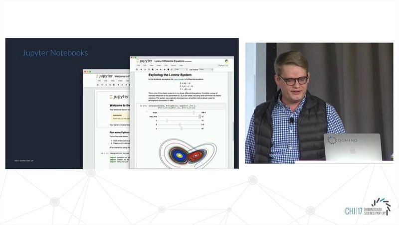
The last piece is getting into Jupyter itself. I want to spend a little bit of time here about how Jupyter fits into this lifecycle. One, it sounds like a lot of people know what Jupyter. A web-based application that lets you run code, add comments, add descriptions, visualizations, and it's really powerful. If we go back to the data science lifecycle, it usually shows up as a tool that data scientists or researchers use. They're editing scripts or executing code, inspecting outputs, and it's really great for that iterative cycle of let me test this thing. “Let me see the result. Let me show that the stakeholders. Let me bring it back.”
One of the ways that we see Jupyter be so valuable in this lifecycle, outside of just this narrow piece, is that a lot of data scientists or researchers, know what tools they like to use when they go from one environment to an academic environment, or a more research-heavy environment to a corporate environment, where you have to prove the value that you're adding, or show the results for what you're working on. It's actually a huge pain to learn an entirely new language, or entirely new system, in order to make a useful visualization for that. Or do it in a way that other people can leverage who aren't coders, data scientists, or don't know Python, don't know R.
One of the reasons Jupyter is so valuable is that you can combine lots of different tools and technologies under one hood. In a way that makes it really easy to get the results that you're generating out to the rest of your organization. From what Greg was showing before me, those are some really cool powerful maps that I don't know if any data scientist could ever have cobbled together after the end of a project. I certainly couldn't, but don't take my word for it. The reason Jupyter becomes so valuable in this context is that you can make some really small changes to the very fundamental platform where you're working. The place where you're doing your data cleaning, your data scripting, your basic charts, your model training, and you're pulling in GPUs for TensorFlow. That same environment can be used to produce the results and distribute the analysis that you've been working on and developing…. in a way that decreases the barrier of entry for a data scientist or a researcher to distribute their results in a way that other people can find valuable.
You don't have to go learn how to write JavaScript or really complicated visualization tools. You can use the stuff that you're already using, if you just have the rigor of documenting what you're doing and displaying it in an intuitive way for others to leverage. Now, you can have the impact of a team of three to five people using one tool, if you're organizing it correctly.
The next thing I want to jump into is a few examples. I'm going to jump into a Jupyter Notebook with some tips and tricks. At JupyterCon this was hands down the most interesting part, because everyone just wants all the code. Hopefully, we've got a little bit of an audience who will be less interested in the line-by-line code, but I will show it to you to prove that it works.
One of the really cool parts of using Jupyter are these Magic commands. The idea behind Magic commands is that they're able to like to open up the world of what's possible under the hood of Jupyter. Behind the scenes, Jupyter is just running a lot of different kernels based on what you're working on. I'll jump into this Python 3 Notebook. Great. So this Magic command is opening up the hood behind what's possible behind the scenes. Where all of these different commands, if you're familiar with Jupyter, you guys have some idea of what it is. Each cell is running a kernel in a shared kernel across cells for Python 2, Python 3, R, Scala, Julia. In this case, we're running Python 3.
So when I hit this LS Magic command, it shows me a list of all these magic commands. I'm not going to run through what all of them do, but I will pull out a few that are really powerful. It'll help us make a really cool dashboard, as long as you're not a cartographer. So a simple one is just exclamation point. You can actually just run things as if they're in the terminal. You can just list all the files inside of this project. This is really common for like installing packages directly from inside of Jupyter, without pulling up a terminal, executing your stuff, and switching back and forth. The same principle applies, so if I just want to run one line, I can do exclamation point run my bash command.
If I want the entire cell to execute, as a bash cell, just do % % bash, and now I'm doing things like checking what version of Pandas I'm running. And this doesn't extend to just bash. In this example, I'm just going to say what version of Python I'm using, Python 3. For the Pythonistas is up there, you'll quickly realize that this is not going to work, because this is not Python 3 syntax. This is Python 2 syntax. I don't know if anyone's ever tried to work in a team that has the constant fight of which version of Python are we going to use. But with something like Jupyter, you can get around that. You don't have to make everyone switch their syntax or rewrite all of their code. You can just run your Python 2 code inside of Python 3 in a Jupyter Notebook using this Python 2 Magic. So we execute this, and now inside of a Python 3 Notebook, we're executing Python 2 inside a Python 2 kernel. Don't have to have a different notebook up, don't have to use Anaconda to manage an entirely new environment. It's just there.
All right, but there's more. There's an open source package called rpy2. “Are there any R users in the audience?” OK, great. So you will appreciate this as opposed to JupyterCon. So now, we can simply just start using R inside of this Jupyter Notebook. The Jupyter users will realize that, of course, you can have a this is of just like bait and switch with the Python 2 thing. Same principle applies. You can have an R kernel running underneath your Jupyter Notebook, but you can also just run R inside of your Python 3 Notebook without having to write it as a string that gets passed to a Python function. So now, we're using R 3.2, and now this is where it gets really cool.
We're going to go back into the normal cell running Python. We're going to go grab the Iris data set, because flowers need more analysis. We can actually pass this Python data frame. This is a Python pandas data frame. We're going to pass this into the R kernel, and because I like dplyr and ggplot, I'm just going to plot this using R inside of my Python 3 Notebook. If you have a colleague who just likes the dplyr more, likes the piping functions, finds them more intuitive, like I do, you can actually use those R commands to analyze your Python data frames. And you can just pass them back and forth. This becomes really easy for this problem or that problem, I'm going to work on whatever tool I'm best at, whatever when I know most….I'll switch into this language for that one, and switch back to this other one as needed.
This becomes really easy to just pick and choose whatever you're most comfortable working with. Really valuable in the data as community, because this is not something that is agreed upon. There is no standard for how you do data science work. Python 2 is slowly getting deprecated, slowly but surely, but people still use it. Python 3 is starting to become more popular. R it still a whole other animal in itself, and it's really hard to marry those two. Jupyter makes it really easy for you to work cohesively as a team, as opposed to like if you want to work with this team you got to go download R Studio. If you want to work on this team, you've got to use pi charm. It gives you one environment to work in, which is pretty sweet.
And so now we're just covering a few other things, like if you're doing more in the academics’ sphere, you can render really cool equations using LaTeX or whatever else you want to use LaTeX for. You can use HTML, which is really sweet. We're going to use this in our dashboard. So just using the HTML magic, you can now render HTML inside of your notebook. It makes it really easy to have interactive charts and visualizations. This is more of the technical side, but also cool, because Jupyter is just an HTML overlay onto some set of kernels. You can reach under the hood and fiddle around with it, which can be dangerous, but there are some easy preset examples.
If you're familiar with the head function, it's going to grab the top few rows. It's going to do some basic stuff. But if you've ever tried to look at more than one data frame at a time, you have to print them individually. It can be a minor annoyance, but also easy to change. We set one of these IPython variables. Now, we can render the head, the tail, describe it, all in one call without printing it, super easy. A couple of others that are really useful, timing for like evaluating how long it takes a function to complete. You can use the timeit function. It will run your code like a million times, and then see what's the average time to compute. So we're just doing a simple loop, and it's going to run a million loops and figure out how fast it goes. Really easy, if you're evaluating the performance of your code inside of Jupyter.
The last is interactive charts and visualizations and plots. So we're using seaborn in this example, their basic pairplot. You guys may be familiar with Matplotlib inline, which lets you show the visualizations. They recently came out with Matplotlib Notebook, which makes those visualizations interactive, as opposed to static. So say I want to-- pairplots are overwhelming all the time-- but say I want to zoom into this specific piece. I can do that for all the visualizations that are relevant. You can just jump straight in, and now it's like an interactive thing, inside of my Jupyter Notebook. It's really simple.
All right, so to save time for questions, I'm going to jump into the final piece, which is taking all of this together. So now, we can pass information between cells, between kernels within cells. So I can do my R script. I can pass it to my Python function. I can pass it back to R and vice versa. And I can render HTML. I can render interactive images. I'm going to take this all the way to the end, and say here I've got this notebook. I've done some analysis. I want other people in my organization to use it, to see it, to look at it. If I send them this, they're just going to shut down. It's like, “This is code. I don't like it. I don't want it.”
But again, Jupyter's super extensible. I've got this little script of HTML, which you can find on Stack Overflow. It's nothing fancy where is just gives me this button. I can toggle this code, and so now all the scary code goes away. And I end up with my map that probably looks terrible by a cartographer's standards, but shows me earthquakes in the US according to the US Geological Service. I can see that fracking doesn't cause any problems in Oklahoma. I can see that nothing's happening in the Northwest. It's really great. And so now, this is a really easy way that I can have a dashboard that other people can follow. They can pop open the code and see what I'm doing. They can see what libraries I'm using. They can see what my data source is, what manipulations I'm doing, how I'm building the visualization. And without having to go rewrite an entirely new application, I can visualize the data the same way that I would visualize it if I was just doing my iterative analysis, and then share it with other people to use. I have no additional work. I have pasted a few snippets that are easily available online, and now I have a dashboard that other people can use, other people can follow. And other people who are not coders can actually take advantage of and incorporate into whatever insights they're generating.
I didn't talk about this slide unfortunately, but it's a great chance to bring it back in. Where there's some spectrum of analysis that you can produce as part of a data science project or quantitative research where you can have an ad hoc report, like the earthquake map that just shows like, “hey, at this point in time, this is what happened.” Obviously, you can go to the very far extreme, which is like machines talking to machines with APIs.
Reproducible dashboards, or even like hosted dashboards that are shareable and usable, are really valuable, because they sit in this area here, where it's the more advanced end of human consumers. We're building something that isn't useful, just wants to inform a single decision. But which can be used to inform your entire thought process around anything from just like, “how do I manage this team? or how do I approach this line of business?” To “how do I drive my company?, how do I go from a qualitative, anecdotally-driven organization to a concerted, quantitative, data-driven institution.” And that's where these sorts of things come in, where it goes from just like, “hey, give me this chart of our sales in this region to what's our projected revenue based off of these things… and how can I see it every day?, and how it's changing?” So that's why dashboards are valuable.
Domino editorial note: this transcript has been lightly edited for readability.

Domino powers model-driven businesses with its leading Enterprise AI platform that accelerates the development and deployment of data science work while increasing collaboration and governance. More than 20 percent of the Fortune 100 count on Domino to help scale data science, turning it into a competitive advantage. Founded in 2013, Domino is backed by Sequoia Capital and other leading investors.
Other posts you might be interested in


Subscribe to the Domino Newsletter
Receive data science tips and tutorials from leading Data Science leaders, right to your inbox.
By submitting this form you agree to receive communications from Domino related to products and services in accordance with Domino's privacy policy and may opt-out at anytime.