
Introduction
Clustering is a machine learning technique that enables researchers and data scientists to partition and segment data. Segmenting data into appropriate groups is a core task when conducting exploratory analysis. As Domino seeks to support the acceleration of data science work, including core tasks, Domino reached out to Addison-Wesley Professional (AWP) Pearson for the appropriate permissions to excerpt "Clustering" from the book, R for Everyone: Advanced Analytics and Graphics, Second Edition. AWP Pearson provided the appropriate permissions to excerpt the book as well as provide a complementary Domino project.
Clustering
Clustering, which plays a big role in modern machine learning, is the partitioning of data into groups. This can be done in a number of ways, the two most popular being K-means and hierarchical clustering. In terms of a data.frame, a clustering algorithm finds out which rows are similar to each other. Rows that are grouped together are supposed to have high similarity to each other and low similarity with rows outside the grouping.
K-means Clustering in R
One of the more popular algorithms for clustering is K-means. It divides the observations into discrete groups based on some distance metric. For this example, we use the wine dataset from the University of California–Irvine Machine Learning Repository, available at http://archive.ics.uci.edu/ml/datasets/Wine.
> wineUrl <- 'http://archive.ics.uci.edu/ml/machine-learning-databases/wine/wine.data'
> wine <- read.table(wineUrl, header=FALSE, sep=',',
+                    stringsAsFactors=FALSE,
+                    col.names=c('Cultivar', 'Alcohol', 'Malic.acid',
+                    'Ash', 'Alcalinity.of.ash',
+                    'Magnesium', 'Total.phenols',
+                    'Flavanoids', 'Nonflavanoid.phenols',
+                    'Proanthocyanin', 'Color.intensity',
+                    'Hue', 'OD280.OD315.of.diluted.wines',
+                    'Proline'
+ ))
> head(wine)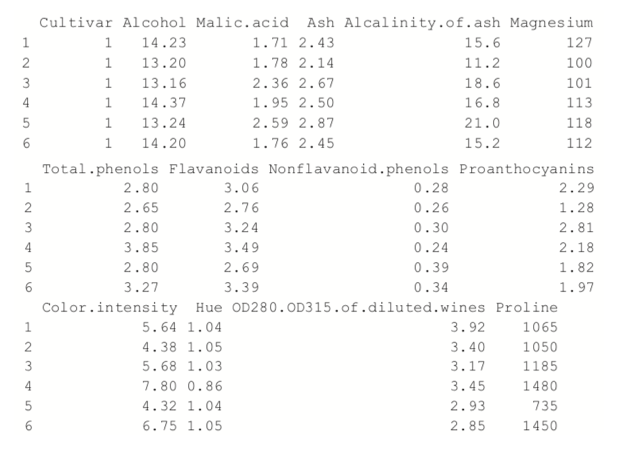
Because the first column is the cultivar, and that might be too correlated with group membership, we exclude that from the analysis.
> wineTrain <- wine[, which(names(wine) != "Cultivar")]
For K-means we need to specify the number of clusters, and then the algorithm assigns observations into that many clusters. There are heuristic rules for determining the number of clusters, which we will get to later. For now we will choose three. In R, K-means is done with the aptly named kmeans function. Its first two arguments are the data to be clustered, which must be all numeric (K-means does not work with categorical data), and the number of centers (clusters). Because there is a random component to the clustering, we set the seed to generate reproducible results.
> set.seed(278613)
> wineK3 <- kmeans(x=wineTrain, centers=3)
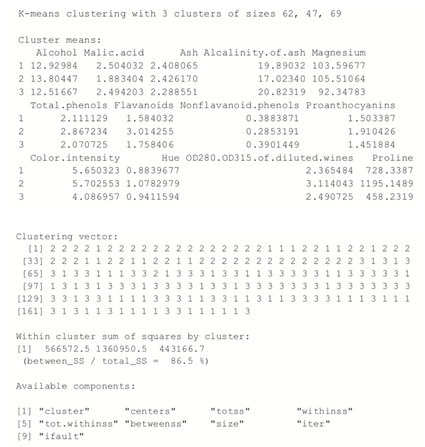
Printing the K-means objects displays the size of the clusters, the cluster mean for each column, the cluster membership for each row and similarity measures.
> wineK3
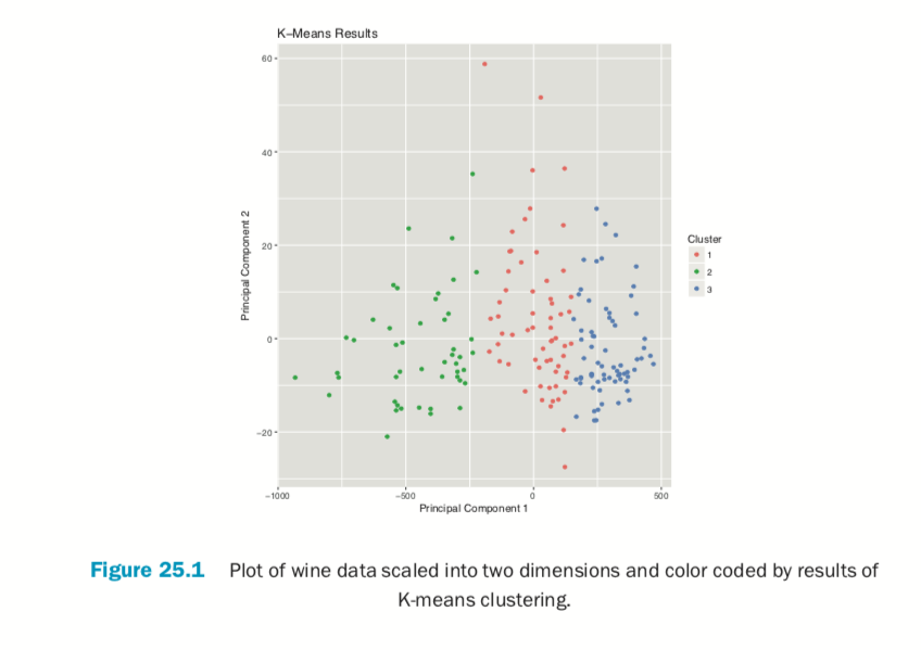
Plotting the result of K-means clustering can be difficult because of the high dimensional nature of the data. To overcome this, the plot.kmeans function in useful performs multidimensional scaling to project the data into two dimensions and then color codes the points according to cluster membership. This is shown in Figure 25.1.
> library(useful)
> plot(wineK3, data=wineTrain)
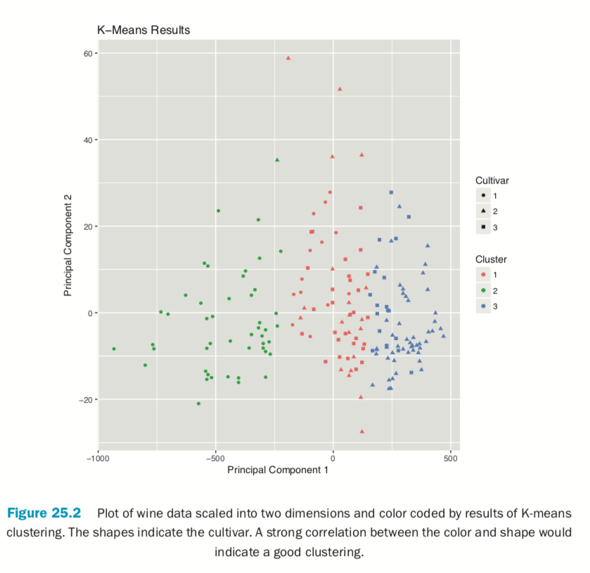
If we pass the original wine data and specify that Cultivar is the true membership column, the shape of the points will be coded by Cultivar, so we can see how that compares to the colors in Figure 25.2. A strong correlation between the color and shape would indicate a good clustering.
> plot(wineK3, data=wine, class="Cultivar")
K-means can be subject to random starting conditions, so it is considered good practice to run it with a number of random starts. This is accomplished with the nstart argument.
> set.seed(278613)
> wineK3N25 <- kmeans(wineTrain, centers=3, nstart=25) > # see the cluster sizes with 1 start
> wineK3$size
[1] 62 47 69> # see the cluster sizes with 25 starts
> wineK3N25$size[1] 62 47 69For our data the results did not change. For other datasets the number of starts can have a significant impact.
Choosing the right number of clusters is important in getting a good partitioning of the data. According to David Madigan, the former chair of Department of Statistics and current Dean of Faculty of Arts and Sciences and Professor of Statistics at Columbia University, a good metric for determining the optimal number of clusters is Hartigan’s rule (J. A. Hartigan is one of the authors of the most popular K-means algorithm). It essentially compares the ratio of the within-cluster sum of squares for a clustering with k clusters and one with k + 1 clusters, accounting for the number of rows and clusters. If that number is greater than 10, then it is worth using k + 1 clusters. Fitting this repeatedly can be a chore and computationally inefficient if not done right. The useful package has the FitKMeans function for doing just that. The results are plotted in Figure 25.3.
> wineBest <- FitKMeans(wineTrain, max.clusters=20, nstart=25, + seed=278613) > wineBest
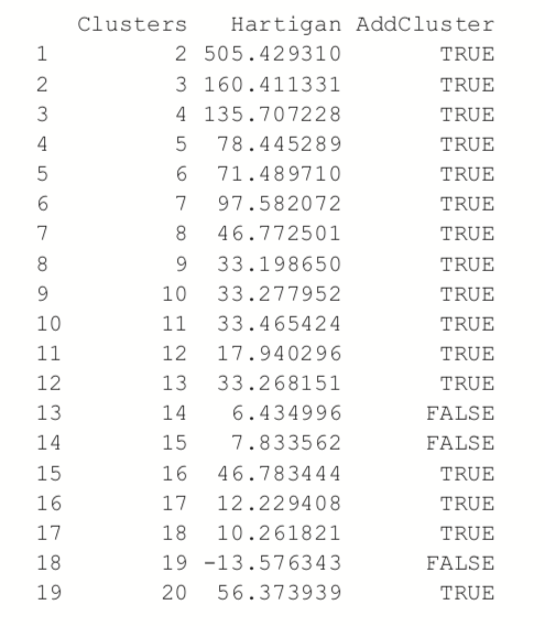
> PlotHartigan(wineBest)
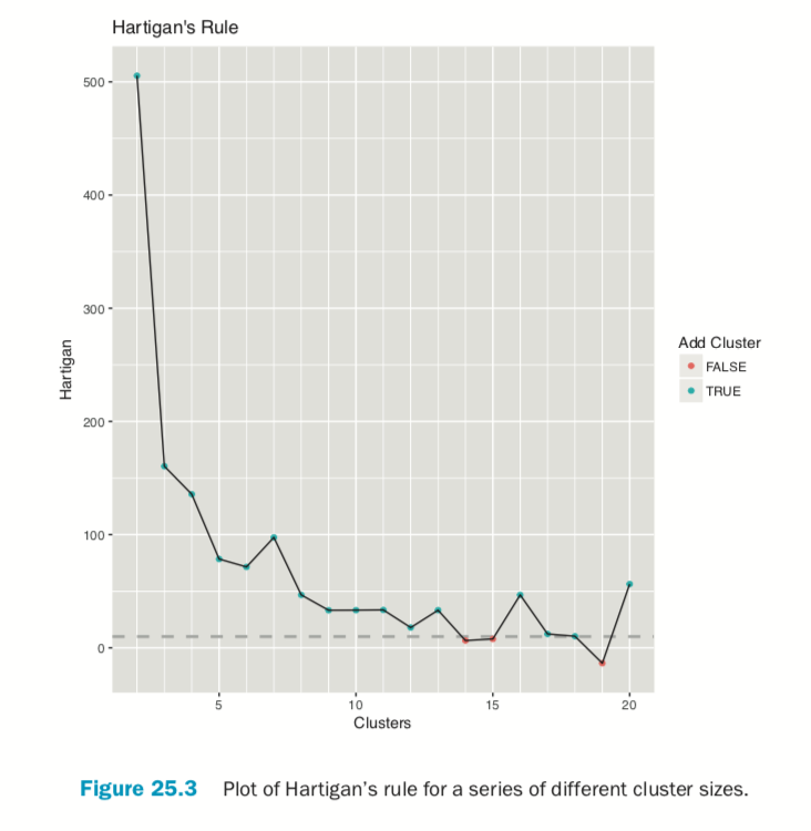
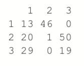
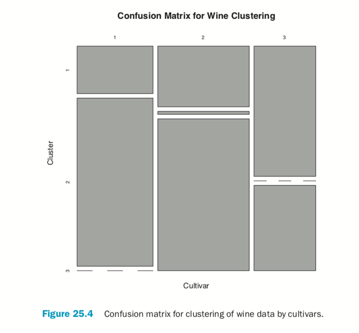
According to this metric we should use 13 clusters. Again, this is just a rule of thumb and should not be strictly adhered to. Because we know there are three cultivars it would seem natural to choose three clusters because there are three cultivars. Then again, the results of the clustering with three clusters did only a fairly good job of aligning the clusters with the cultivars, so it might not be that good of a fit. Figure 25.4 shows the cluster assignment going down the left side and the cultivar across the top. Cultivar 1 is mostly alone in its own cluster, and cultivar 2 is just a little worse, while cultivar 3 is not clustered well at all. If this were truly a good fit, the diagonals would be the largest segments.
> table(wine$Cultivar, wineK3N25$cluster)
> plot(table(wine$Cultivar, wineK3N25$cluster),
+      main="Confusion Matrix for Wine Clustering",
+      xlab="Cultivar", ylab="Cluster")
An alternative to Hartigan’s rule is the Gap statistic, which compares the within-cluster dissimilarity for a clustering of the data with that of a bootstrapped sample of data. It is measuring the gap between reality and expectation. This can be calculated (for numeric data only) using clusGap in cluster. It takes a bit of time to run because it is doing a lot of simulations.
> library(cluster)
> theGap <- clusGap(wineTrain, FUNcluster=pam, K.max=20) > gapDF <- as.data.frame(theGap$Tab) > gapDF
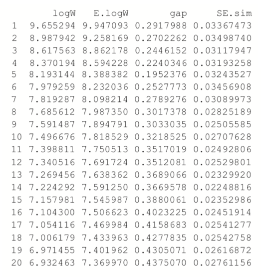
Figure 25.5 shows the Gap statistic for a number of different clusters. The optimal number of clusters is the smallest number producing a gap within one standard error of the number of clusters that minimizes the gap.
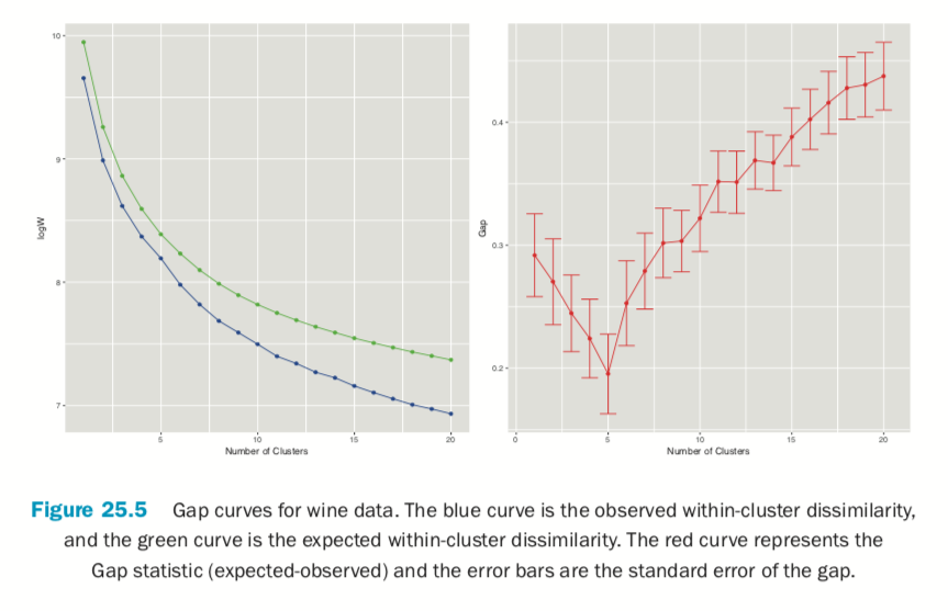
> # logW curves
> ggplot(gapDF, aes(x=1:nrow(gapDF))) +
+     geom_line(aes(y=logW), color="blue") +
+     geom_point(aes(y=logW), color="blue") +
+     geom_line(aes(y=E.logW), color="green") +
+     geom_point(aes(y=E.logW), color="green") +
+     labs(x="Number of Clusters")
>
> # gap curve
> ggplot(gapDF, aes(x=1:nrow(gapDF))) +
+     geom_line(aes(y=gap), color="red") +
+     geom_point(aes(y=gap), color="red") +
+     geom_errorbar(aes(ymin=gap-SE.sim, ymax=gap+SE.sim), color="red") +
+     labs(x="Number of Clusters", y="Gap")
For this data the minimum gap of 0.1952376 is for the clustering with five clusters. In this case there are no clusterings with fewer clusters that are within one standard error of the minimum. So, according to the Gap statistic, five clusters is optimal for this dataset.
Partitioning Around Medoids (PAM)
Two problems with K-means clustering are that it does not work with categorical data and it is susceptible to outliers. An alternative is K-medoids. Instead of the center of a cluster being the mean of the cluster, the center is one of the actual observations in the cluster. This is akin to the median, which is likewise robust against outliers.
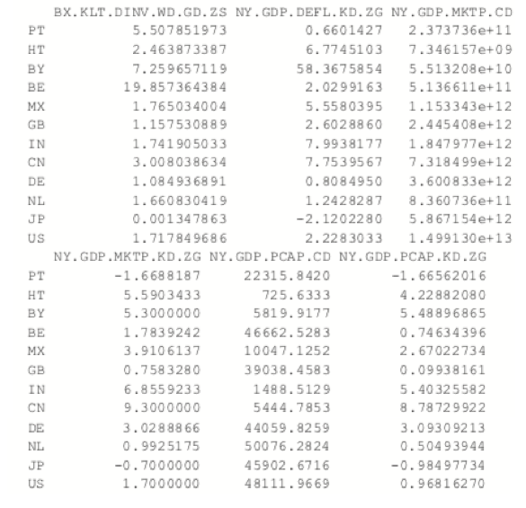
The most common K-medoids algorithm is Partitioning Around Medoids (PAM). The cluster package contains the pam function for performing Partitioning Around Medoids. For this example, we look at some data from the World Bank, including both numerical measures such as GDP and categorical information such as region and income level.
Now we use the country codes to download a number of indicators from the World Bank using WDI.
> indicators <- c("BX.KLT.DVNV.WD.GD.ZS", "NY.GDP.DEFL.KD.ZG", + "NY.GDP.MKTP.CD", "NY.GDP.MKTP.KD.ZG" + "NY.GDP.MKTP.CD", "NY.GDP.MKTP.KD.ZG" + "TG.VAL.TOTL.GD.ZS") > library(WDI)
>
> # pull info on these indicators for all countries in our list
> # not all countries have information for every indicator
> # some countries do not have any data
> wbInfo <- WDI(country="all", indicator=indicators, start=2011, + end=2011, extra=TRUE) > # get rid of aggregated info
> wbInfo <- wbInfo[wbInfo$region != "Aggregates", ] > # get rid of countries where all the indicators are NA
> wbInfo <- wbInfo[which(rowSums(!is.na(wbInfo[, indicators])) > 0), ]
> # get rid of any rows where the iso is missing
> wbInfo <- wbInfo[!is.na(wbInfo$iso2c), ]
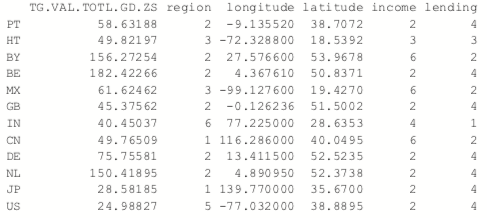
The data have a few missing values, but fortunately pam handles missing values well. Before we run the clustering algorithm we clean up the data some more, using the country names as the row names of the data.frame and ensuring the categorical variables are factors with the proper levels.
> # set rownames so we know the country without using that for clustering
> rownames(wbInfo) <- wbInfo$iso2c > # refactorize region, income and lending
> # this accounts for any changes in the levels
> wbInfo$region <- factor(wbInfo$region) > wbInfo$income <- factor(wbInfo$income) > wbInfo$lending <- factor(wbInfo$lending)
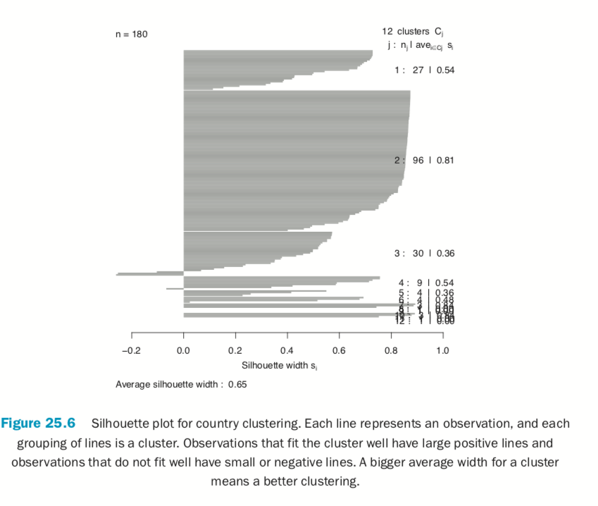
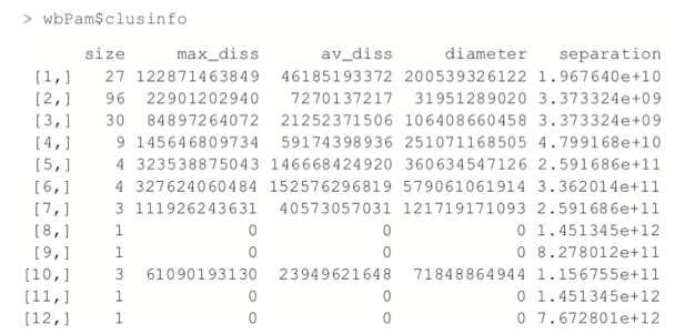
Now we fit the clustering using pam from the cluster package. Figure 25.6 shows a silhouette plot of the results. As with K-means, the number of clusters need to be specified when using PAM. We could use methods like the Gap statistic, though we will choose 12 clusters, as this is slightly less than the square root of the number of rows of data, which is a simple heuristic for the number of clusters. Each line represents an observation, and each grouping of lines is a cluster. Observations that fit the cluster well have large positive lines, and observations that do not fit well have small or negative lines. A bigger average width for a cluster means a better clustering.
> # find which columns to keep
> # not those in this vector
> keep.cols <- which(!names(wbInfo) %in% c("iso2c", "country", "year", + "capital", "iso3c")) > # fit the clustering
> wbPam <- pam(x=wbInfo[, keep.cols], k=12, + keep.diss=TRUE, keep.data=TRUE) >
> # show the medoid observations
> wbPam$medoids
> # make a silhouette plot
> plot(wbPam, which.plots=2, main="")
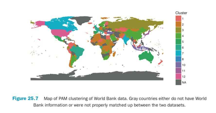
Because we are dealing with country level information, it would be informative to view the clustering on a world map. As we are working with World Bank data, we will use the World Bank shapefile of the world. It can be downloaded in a browser as we would any other file or by using R. While this may be slower than using a browser, it can be nice if we have to programmatically download many files.
> download.file(url="http://jaredlander.com/data/worldmap.zip",
+ destfile="data/worldmap.zip", method="curl")
The file needs to be unzipped, which can be done through the operating system or in R.
> unzip(zipfile="data/worldmap.zip", exdir="data")
Of the four files, we only need to worry about the one ending in .shp because R will handle the rest. We read it in using readShapeSpatial from maptools.
> library(maptools)
> world <- readShapeSpatial( + "data/world_country_admin_boundary_shapefile_with_fips_codes.shp" + ) > head(world@data)
There are some blatant discrepancies between the two-digit code in the World Bank shapefile and the two-digit code in the World Bank data pulled using WDI. Notably, Austria should be “AT,” Australia “AU,” Myanmar (Burma) “MM,” Vietnam “VN” and so on.
> library(dplyr)
> world@data$FipsCntry <- as.character(
+     recode(world@data$FipsCntry,
+            AU="AT", AS="AU", VM="VN", BM="MM", SP="ES",
+            PO="PT", IC="IL", SF="ZA", TU="TR", IZ="IQ",
+            UK="GB", EI="IE", SU="SD", MA="MG", MO="MA",
+            JA="JP", SW="SE", SN="SG")
+ )
In order to use ggplot2 we need to convert this shapefile object into a data.frame, which requires a few steps. First we create a new column, called id, from the row names of the data. Then we use the tidy function from the broom package, written by David Robinson, to convert it into a data.frame. The broom package is a great general purpose tool for converting R objects, such as lm models and kmeans clusterings, into nice, rectangular data.frames.
> # make an id column using the rownames
> world@data$id <- rownames(world@data) > # convert into a data.frame
> library(broom)
> world.df <- tidy(world, region="id") > head(world.df)
Now we can take the steps of joining in data from the clustering and the original World Bank data.
> clusterMembership <- data.frame(FipsCntry=names(wbPam$clustering), + Cluster=wbPam$clustering, + stringsAsFactors=FALSE) > head(clusterMembership)
> world.df <- left_join(world.df, clusterMembership, by="FipsCntry") > world.df$Cluster <- as.character(world.df$Cluster) > world.df$Cluster <- factor(world.df$Cluster, levels=1:12)
Building the plot itself requires a number of ggplot2 commands to format it correctly. Figure 25.7 shows the map, color coded by cluster membership; the gray countries either do not have World Bank information or were not properly matched up between the
two datasets.
> ggplot() +
+    geom_polygon(data=world.df, aes(x=long, y=lat, group=group,
+                                    fill=Cluster, color=Cluster))
+    labs(x=NULL, y=NULL) + coord_equal() +
+    theme(panel.grid.major=element_blank(),
+          panel.grid.minor=element_blank(),
+          axis.text.x=element_blank(), axis.text.y=element_blank(),
+          axis.ticks=element_blank(), panel.background=element_blank())
Much like with K-means, the number of clusters in a K-medoids clustering must be specified. Something similar to Hartigan’s Rule can be built using the dissimilarity information returned by pam.
Hierarchical Clustering in R
Hierarchical clustering builds clusters within clusters, and does not require a pre-specified number of clusters like K-means and K-medoids do. A hierarchical clustering can be thought of as a tree and displayed as a dendrogram; at the top there is just one cluster consisting of all the observations, and at the bottom each observation is an entire cluster. In between are varying levels of clustering.
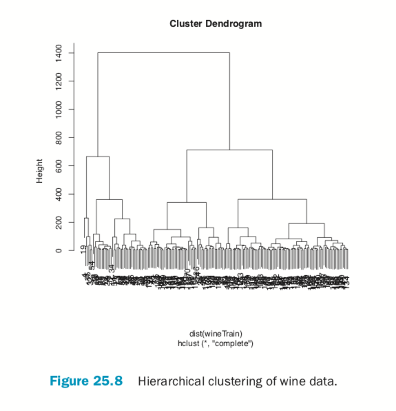
Using the wine data, we can build the clustering with hclust. The result is visualized as a dendrogram in Figure 25.8. While the text is hard to see, it labels the observations at the end nodes.
> wineH <- hclust(d=dist(wineTrain)) > plot(wineH)
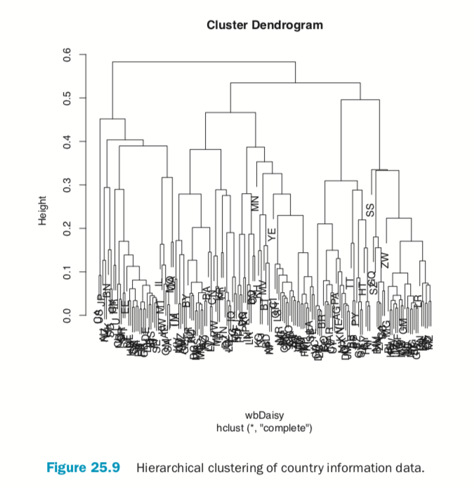
Hierarchical clustering also works on categorical data like the country information data. However, its dissimilarity matrix must be calculated differently. The dendrogram is shown in Figure 25.9.
> # calculate distance
> keep.cols <- which(!names(wbInfo) %in% c("iso2c", "country", "year", + "capital", "iso3c")) > wbDaisy <- daisy(x=wbInfo[, keep.cols]) >
> wbH <- hclust(wbDaisy) > plot(wbH)
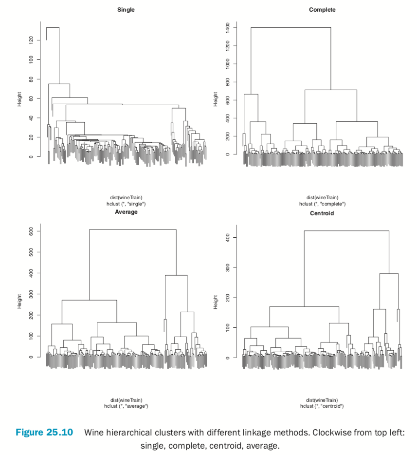
There are a number of different ways to compute the distance between clusters and they can have a significant impact on the results of a hierarchical clustering. Figure 25.10 shows the resulting tree from four different linkage methods: single, complete, average and centroid. Average linkage is generally considered the most appropriate.
> wineH1 <- hclust(dist(wineTrain), method="single") > wineH2 <- hclust(dist(wineTrain), method="complete") > wineH3 <- hclust(dist(wineTrain), method="average") > wineH4 <- hclust(dist(wineTrain), method="centroid") >
> plot(wineH1, labels=FALSE, main="Single")
> plot(wineH2, labels=FALSE, main="Complete")
> plot(wineH3, labels=FALSE, main="Average")
> plot(wineH4, labels=FALSE, main="Centroid")
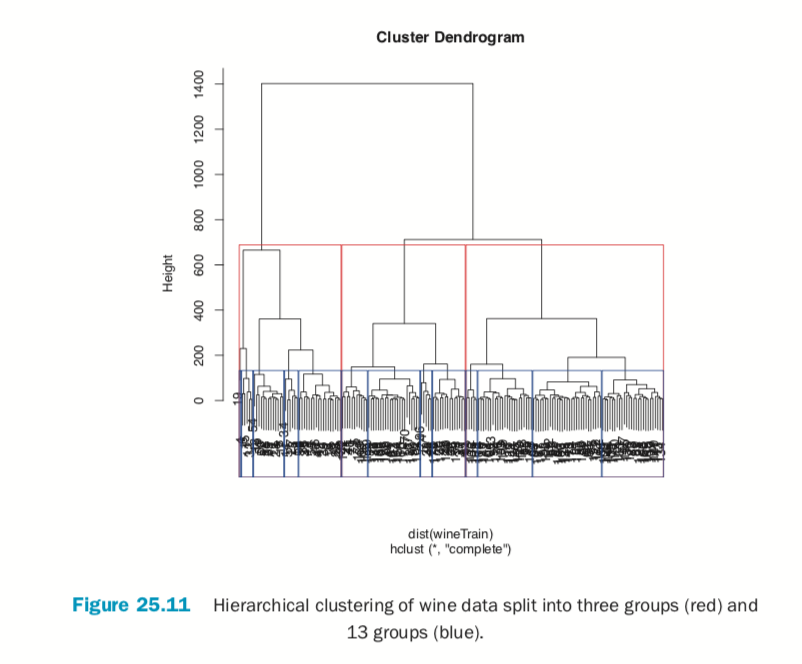
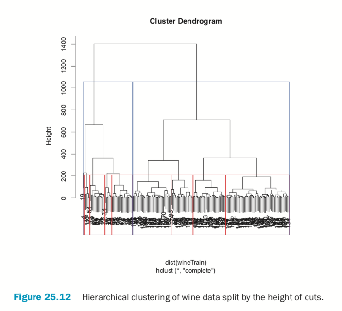
Cutting the resulting tree produced by hierarchical clustering splits the observations into defined groups. There are two ways to cut it: either specifying the number of clusters, which determines where the cuts take place, or specifying where to make the cut, which determines the number of clusters. Figure 25.11 demonstrates cutting the tree by specifying the number of clusters.
> # plot the tree
> plot(wineH)
> # split into 3 clusters
> rect.hclust(wineH, k=3, border="red") > # split into 13 clusters
> rect.hclust(wineH, k=13, border="blue")
> # plot the tree
> plot(wineH)
> # split into 3 clusters
> rect.hclust(wineH, h=200, border="red") > # split into 13 clusters
> rect.hclust(wineH, h=800, border="blue")
Conclusion
Clustering is a popular technique for segmenting data. The primary options for clustering in R are kmeans for K-means, pam in cluster for K-medoids and hclust for hierarchical clustering. Speed can sometimes be a problem with clustering, especially hierarchical clustering, so it is worth considering replacement packages like fastcluster, which has a drop-in replacement function, hclust, which operates just like the standard hclust, only faster.

Domino Data Lab empowers the largest AI-driven enterprises to build and operate AI at scale. Domino’s Enterprise AI Platform unifies the flexibility AI teams want with the visibility and control the enterprise requires. Domino enables a repeatable and agile ML lifecycle for faster, responsible AI impact with lower costs. With Domino, global enterprises can develop better medicines, grow more productive crops, develop more competitive products, and more. Founded in 2013, Domino is backed by Sequoia Capital, Coatue Management, NVIDIA, Snowflake, and other leading investors.


Subscribe to the Domino Newsletter
Receive data science tips and tutorials from leading Data Science leaders, right to your inbox.
By submitting this form you agree to receive communications from Domino related to products and services in accordance with Domino's privacy policy and may opt-out at anytime.