How Atlassian Uses Data Science to Improve Collaboration
Grigoriy2017-03-20 | 13 min read
Christy Bergman, Data Scientist at Atlassian, gives an inside look at how they use data science to improve user onboarding and collaboration. This talk was recorded at a Data Science Popup event.
17:20
- Original
- 1080p
- 720p
- 540p
- 224p
- Captions
Video Transcript
I ended up making my talk about my own experience as a data scientist at Atlassian. So the structure is:
- a little bit about what is Atlassian,
- what does our data look like,
- then dive into a particular data problem in a particular product.
What is Atlassian
Atlassian, in a sentence, is software to help teams collaborate better.
So for planning you can plan your project in Trello, for example. You can put your code into Bitbucket. We have sourced trees like the GUI for Bitbucket, and code quality checks with FishEye, Crucible. If you want to share your data or stories with other people, Confluence the wiki page. And if you need a real time chat with people there's HipChat. And then the tickets are customer tickets in JIRA Service Desk. And Bamboo for the continuous integration. And then StatusPage lets you know when there's problems.
Atlassian is a Sydney, Australia-based company. It was founded in 2002. (I learned all this having to put this presentation together.) And so they founded in 2002, two Australia guys with a total of $10,000 on their own credit cards.
By 2009, they had 10,000 customers... By 2015, they went IPO with 50,000. Today we're at about 70,000 customers and 1.5 thousand employees worldwide. We're inside a company so we're not ginormous, but it's interesting enough, I think.
What Our Data Looks Like
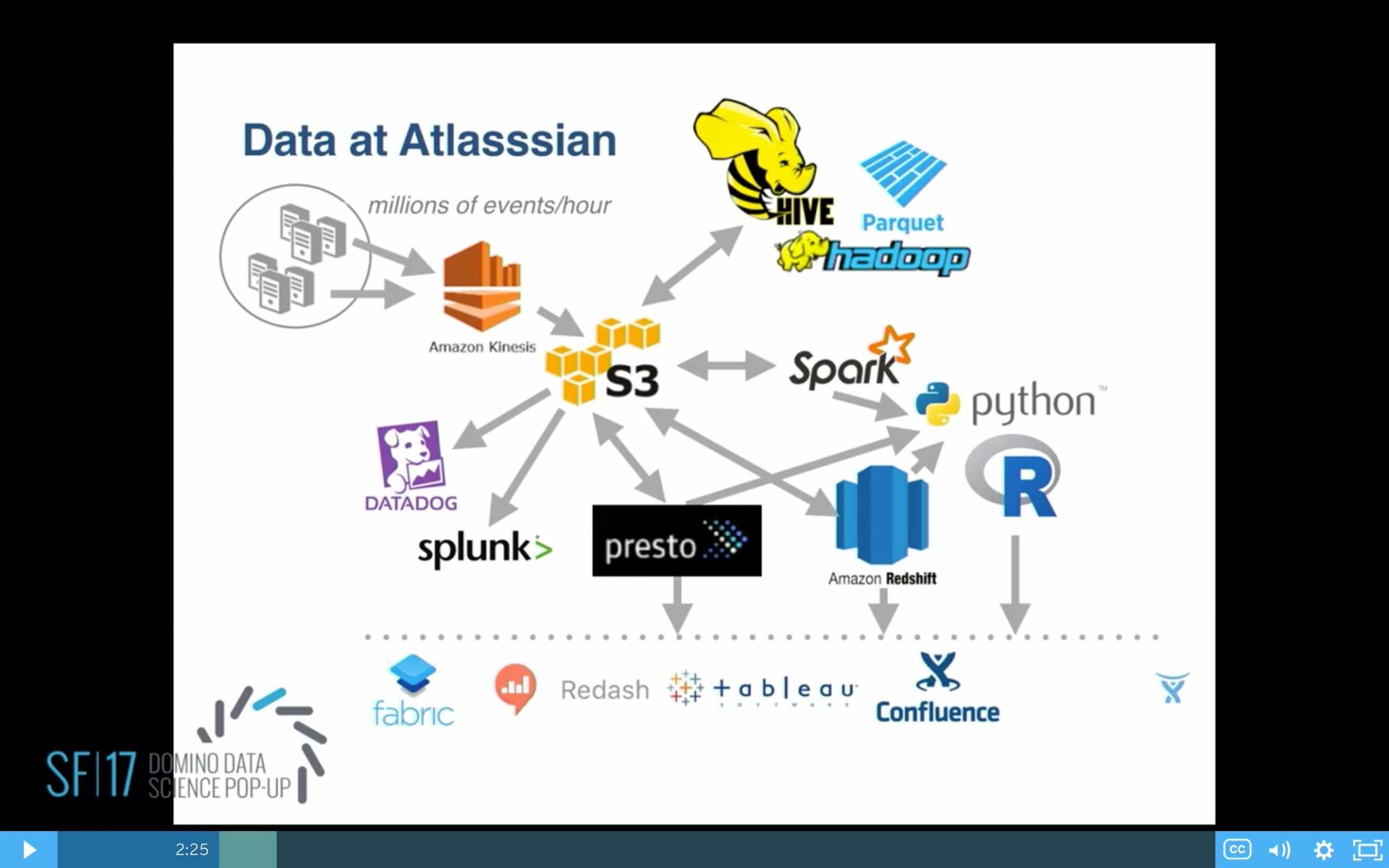
So we've got our events coming in on the scale of millions of events per hour. We bring them into S3. We've got various back-end tools. Today we're moving into parquet. We've got Datadog and Splunk for the raw logs. And there's our data science tools there. For front end visualization, we use a number of things, Fabric, Redash, some Tableau, and our own confluence pages.
Data scientists and data analysts at Atlassian are generally in two camps: There's product analysts, and there's business analysts, and there's a lot of overlap in between.
So the product analysts typically are focused on analyzing product usage, solving problems about what features are used and what features to develop, making suggestions for a single product or cross products or certain segments, like new users and returning users, admins, non admins, etc. And there's also a lot of experimentation going on in the products.
Business analysts tend to be more corporate-focused. And they do things like sales analysis, marketing analysis, email, website, finance, user experience, customer support, strategy, and ops.
Today, we have about 10 analysts, mainly based in Sydney, that are product analysts. And today, apparently, we have 37 business analysts based in San Francisco. I want to focus this talk mainly on the product analytic side, because I am a product analyst. And I'm going to talk about I'm a single product—HipChat—and a single customer segment: new users.
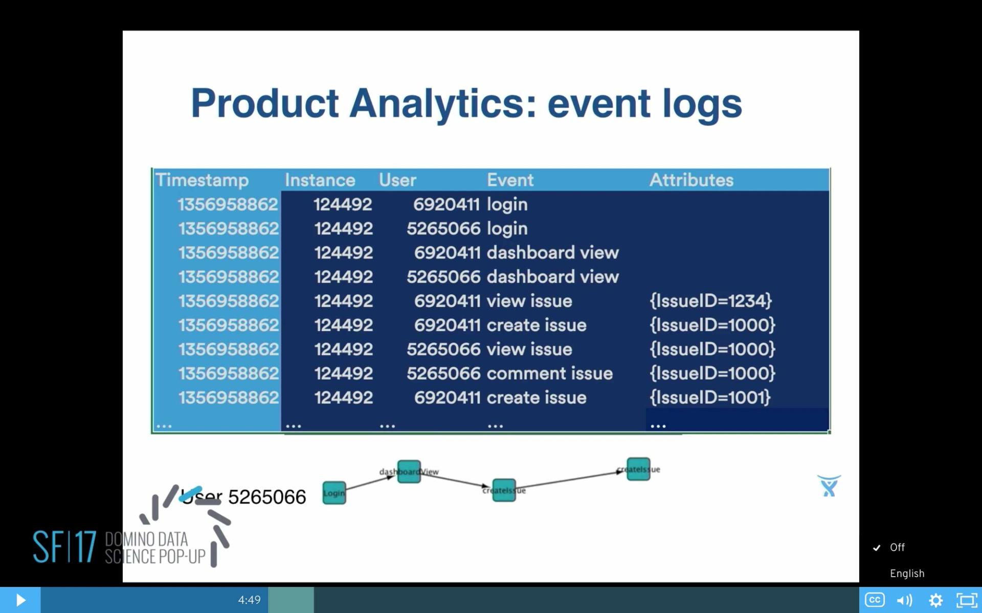
The core for a product analyst is the event logs. I think probably most of you've seen the event logs. They typically have a time stamp, anonymized data about our customers, the company name, the customer, what they did, and some attributes about what they did.
For example, this is a little excerpt of JIRA. We know that they are doing things like viewing a dashboard, logging in, and looking at issues, creating issues, and in the attributes we might have the issue ID, for example. And then from the event logs we can derive a picture of user so-and-so and all the events that they did.
Particular Problem in HipChat
This is a product HipChat, and the product managers knew that this was a problem that all the users were coming in and they were seeing the same thing. They just see a list alphabetized of any room and any person in the whole company.
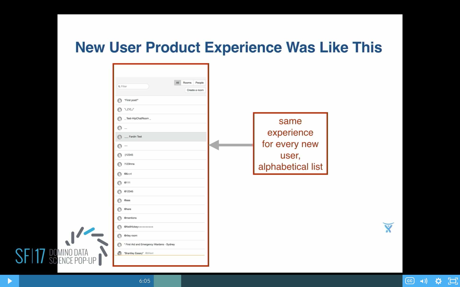
The business gut feeling was: OK, if we show them all the things, then it will maximize the chance of somebody clicking on something. But then eventually, at some point, they realize, OK, our business gut feeling is probably not right. Let's see what he can do about it.
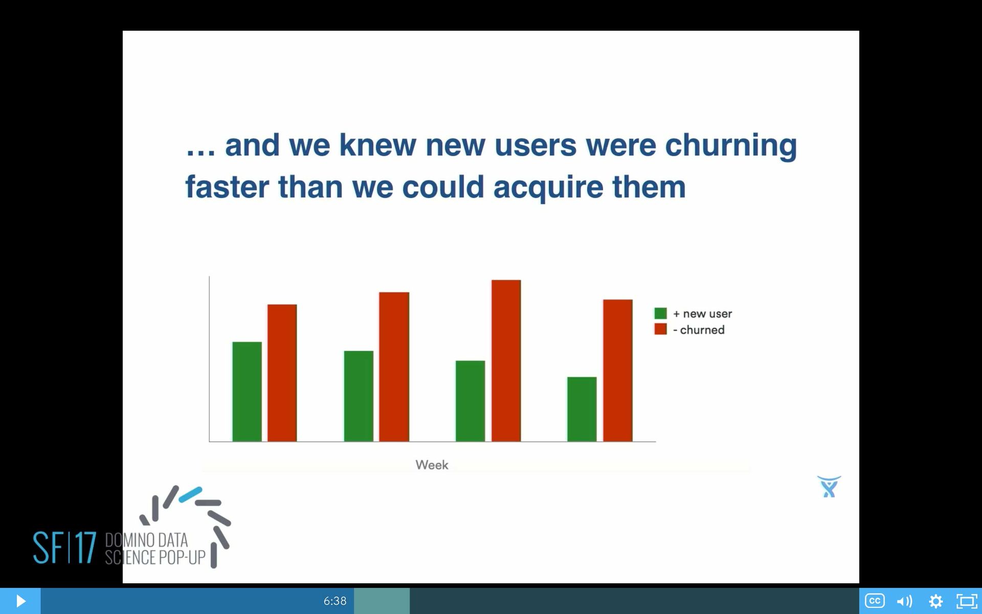
From a data side, I can verify that yes, it really is a problem here, because we can see that our churn—the red bars—are higher than our green bars, the new users coming in. Yes, you do have a problem there.
Can we make it better? But how do you make it better if you don't have much data? Because, for new users they're coming in—this is a view. Each row is a user, each column is a day. And see mostly vertical bars there in that scatterplot, which means most users are coming in for a day, they do something, and then they leave. And then if you look at it a little bit closer, on the right hand side, yes indeed that's what's happening. A lot of people coming in one day, and they do one, maybe two, events, and most of them aren't coming back. Definitely, a regression model isn't going to work here.
Let's try some data science. Basic model building, first step, extract the features. So we take all the new users. We take all their event logs. We get from the event logs, devices and apps that they're using, and then derive a conversion variable, 0/1.
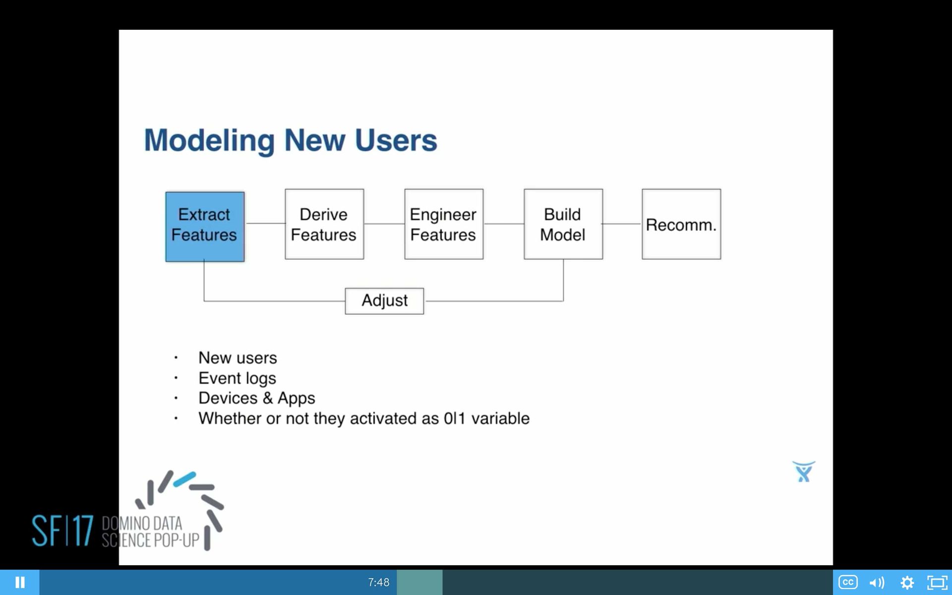
And I should have said this earlier, related to what other people were talking about. We do have decentralized data science at Atlassian, so that's why we have a data scientist in all these different teams, the products in the business. And we also have a company-wide definition of conversion for activation.
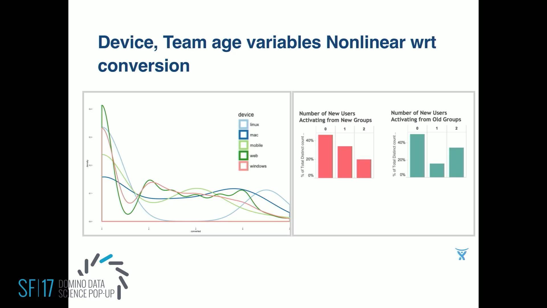
So whether or not the activated is defined for us as, did the user do what we call our sticky events, on three or more days in a week. Looking at some of the variables and just plotting them. So on that x-axis I've got conversion as the number rather than just 0, 1. I count how many days did they activate on the vertical axis. Normalized, on the left is device that they used. And then on the right I've got size of teams split into two. So first off, when eyeballing that you can see it's very non-linear. So that gives you another clue.
Next up is derive some features. Here's where I worked with the product managers closely. They came up with a whole bunch of ideas of what could possibly be important for these users. Is it the size of the team that they're joining? And teams here for us are companies who are our customers. Customers are typically like Netflix, Twitter, Expedia, or Citibank.
So that team, how old are they? How big are they, in Atlassian? Are they public-run or private-run? What was the time lapse in seconds between the first and second user?
We came up with a whole laundry list of ideas. And team collaboration measures a lot of things about how people are working together on that particular team, how connected they are, how cliquey they are. Cliquey refers to small groups working together and not necessarily working across the whole company.
For example, some of the team collaboration measures we have are the Bacon number, which was made famous by Facebook, which said originally that all people on earth were connected by six degrees of separation. But recently, because people are now used to talking to people they don't really know very well on Facebook, it's like 4.73, I think, is the current Bacon number.
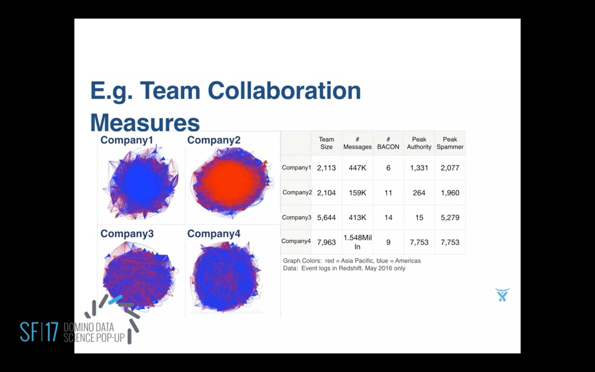
What's curious about work teams is work teams are maybe a bit more, what's the word, conservative. People really don't talk to people that they don't know very well. We can calculate peak authority, which in terms of a social network is people who tend to do more outgoing messages than incoming. And Peak spammers are—I'm sorry, I think I said the opposite. Peak spammers are the ones who send stuff out all the time. So they're very chatty. And it turns out some of these chatty spammers are bots, which is tricky for data scientist. And peak authorities.
We take all this feature data... The next step is to do some engineering on it. For example, you drop out the data that isn't adding any information, like some things that are constant values, or zeros, or maybe too unique, like a user ID is unique for every user. That's not going to tell you anything. So drop all those kind of variables out.
The other variables you might need to do some binning. For example, here's one field. You might look at the group page that the new users are joining. How old is that team that the new user is joining? When you first look at it, it might look like, oh, everybody's joining a new team. That peak at zero and then it looks random afterwards. But if you do a log transform of it, then you're going to see that there is actually more structure in there. And there're two peaks, two natural peaks, which makes sense that new users are joining a new team and that log-10 looks like about 0.5. So they're less than a week old as the age of the team that they're joining.
The next peak is around three, so they're a little bit more than two years old typically. That would be like some new employee joining Atlassian, for example, that second big peak. So then you know you need two segments naturally.
This led to building four models instead of just one model for all of these new users. Another way to think about it is that you don't want something coming out of your models saying, "Well if that new user had just joined an older team they'd be better off." You can't do that. You can't change time. So try different kind of models such as logistic regression, and standard random forest. I ended up, for this problem, settling on XGBoost, and I really liked the results.
Then you might need to adjust. In my case, I got some more data, presence data, of all the other indicators of who was present when this new user joined. I had to keep modifying the model.
In the end, you want to make some recommendations. These are just some example recommendations that came out of this model. That based on the website, if it's small then have that user dropped into a one-on-one conversation. If it's at least six people, there seems to be more group dynamics going on, so drop them into one of your more active groups.
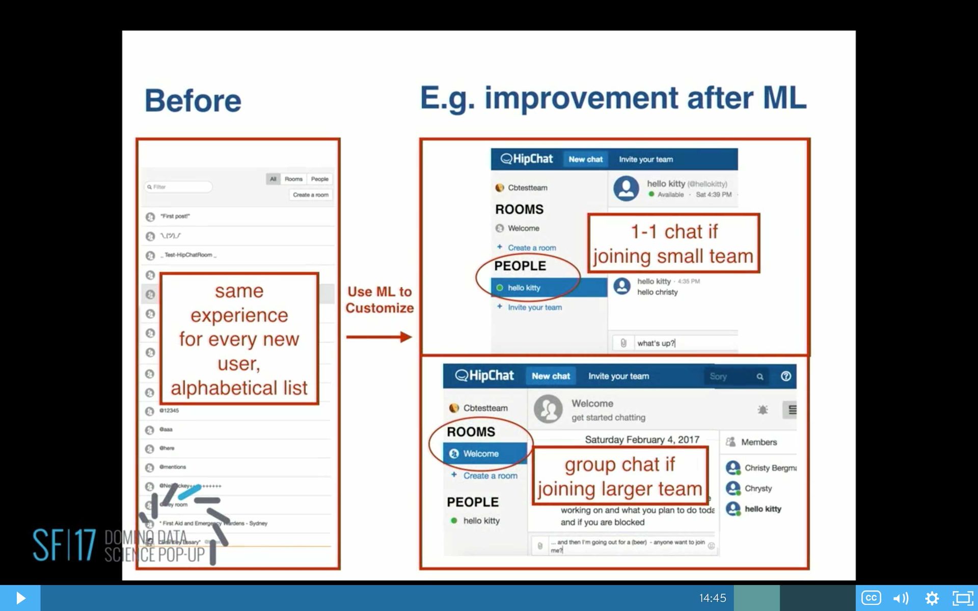
This is the end result. We started out with new users on the left. They all had the same experience, and this is one of the results of modeling. We came up with changing the product. We do an A/B test before this goes into production, but this one came out into production that now users are dropped into different experiences based on the group size. If they're small, they get dropped into people, so they can one-on-one chat. If it's a larger team, they get dropped into a room.
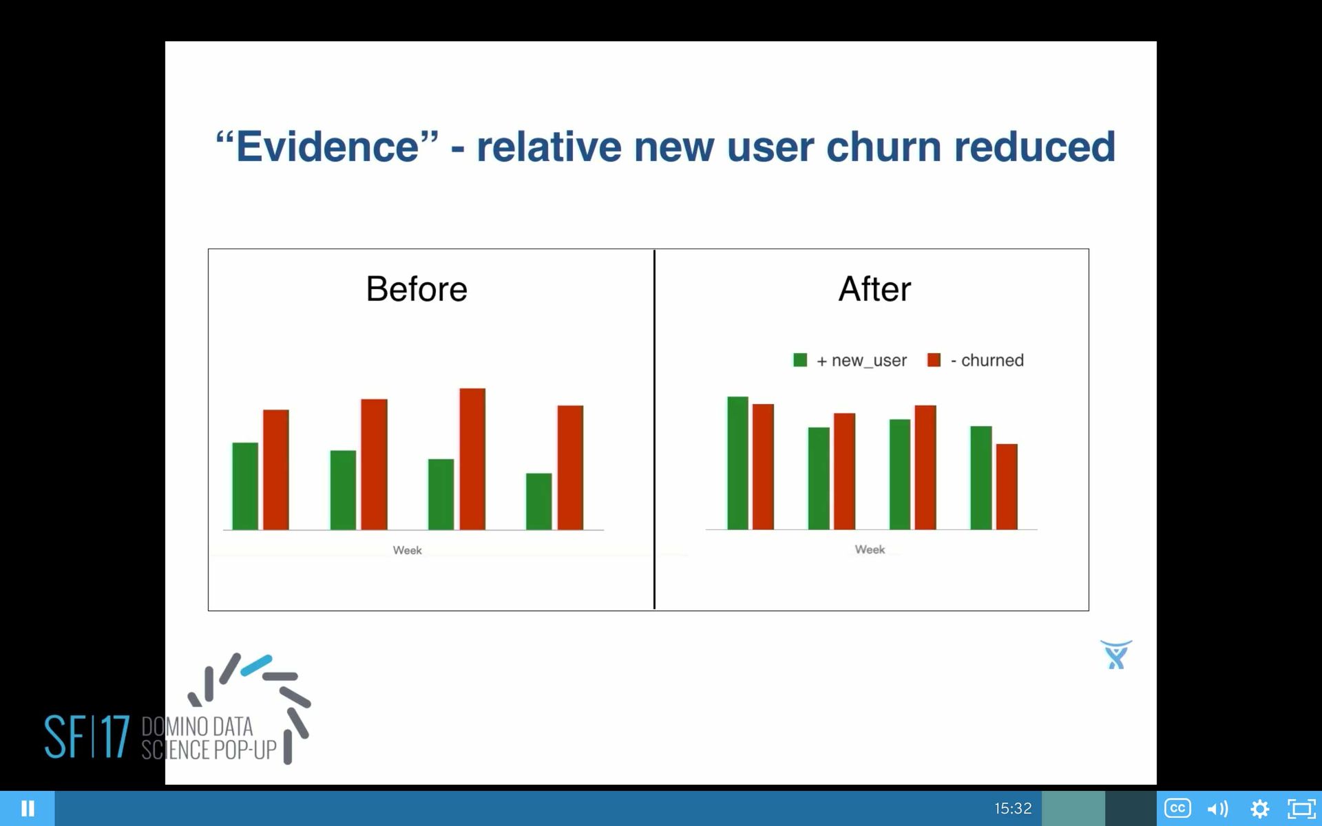
So, the numbers: Yes, it does look like we improve things. It's been about six months since we went live with this. On the left, we had clearly red bars higher than green. On the right, about six months later, now we made some improvements, but we still have a ways to go.
Also, before going live, on the top chart, we were plotting our group activation. Before, it was pretty steady, and then we managed to get it up 59% and it stayed up since then.
We also had our user engagement numbers similarly. We split them up by founder and non-founder. We saw a 31% lift, and it stayed up for the last six months.
What's Next
Coming up next, some more challenges are to expand the use of data science at Atlassian into more products and deeper product features. We need to understand and improve on those team collaboration measures.
It was really time consuming to extract the event features, but we're working on that now by converting all of our events from JSON to Parquet, which I'm really looking forward to. And I would like to get faster at that feature-engineering stuff, because for me it was very manual, eyeballing, making histograms, making guesses of the transform. I would like that to be faster.
Summary
SHARE


Subscribe to the Domino Newsletter
Receive data science tips and tutorials from leading Data Science leaders, right to your inbox.
By submitting this form you agree to receive communications from Domino related to products and services in accordance with Domino's privacy policy and may opt-out at anytime.