Visualizing Machine Learning with Plotly and Domino
Chelsea Douglas2016-04-26 | 5 min read
I recently had the chance to team up with Domino Data Lab to produce a webinar that demonstrated how to use Plotly to create data visualizations inside of Domino notebooks. In this post, I'll share a few of the benefits that I discovered while using Plotly and Domino together.
Plotly is a web-based data visualization platform for data scientists and engineers. The engine behind our platform is plotly.js, an open source charting library built on D3.js and stack.gl. We have APIs for R, Python, and MATLAB to make it easy for data scientists to work in the programming language of their choice, and accessible for teams that work in multiple languages. This works really well with Domino's platform, where you can create notebooks in a variety of languages. Below I'll showcase two examples, one in R and one in Python.
Plotly & R
First, let's check out an example in R. I'll use some twitter data from Plotly's twitter account to show how to create an interactive 2-D visualization for K-Means clustering using Plotly's R Library. This example is based on a previous r-bloggers post. Arguably my favorite feature of Domino's notebooks is the ability to open an RStudio session in the browser tab. I highly recommend starting an RStudio session in Domino and testing this out for yourself!
Set-Up
In R, we'll first install the necessary packages, load the libraries, and then use a twitter app to initiate authentication and pull in data from twitter.
Exploratory Data Analysis
Typically, it's a good first step to use the raw data for exploratory data analysis. As a preliminary visualization, I'll create a simple scatter plot of all the features that will go into the cluster analysis. I'll define my dataset as well as x and y variables inside the plot_ly() function. I'll also add a title and axes titles to my layout. You can check out Plotly's R Scatter documentation for more examples.
It appears that the elbow is approximately at N = 7.
Fitting the model
Now that I've chosen an appropriate number of clusters, I need to fit the model. When plotting the model, I'll manually specify the colors for each cluster. plot_ly() can automatically assign colors based on groups. You could either use the color or the group arguments to do so. Refer to the R figure reference for more details.
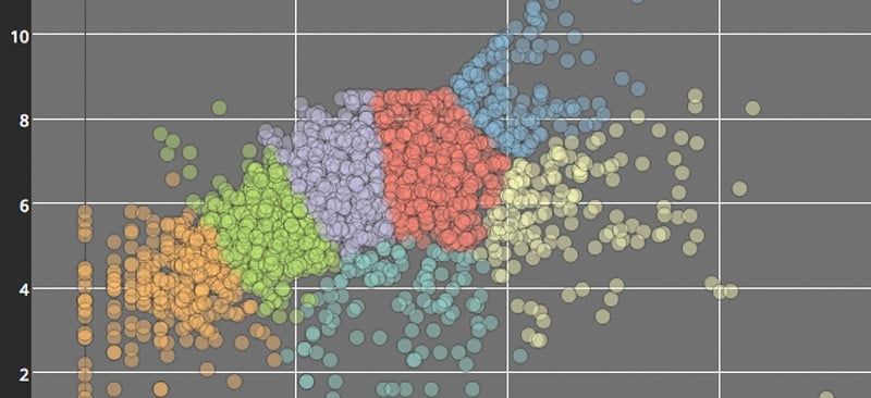
Visualize the Clusters
plot_ly() can be used to create the scatter trace. One of my key styling tips for the graph below is defining the marker opacity of the scatter points. Since this scatter plot is a bit dense, it's a good method to employ in order to see and compare density of points across the plot. Additionally, layout() allows for finer adjustments as shown below.
Set-up
If you're running this in Domino, you'll get to take advantage of the extensive selection of python packages (including plotly!) already installed in their environment. You can start by opening a notebook and importing the necessary packages. Below I'll import plotly as well as some functions from scikit-learn (a machine learning package),numpy, and os, and then I'll add my plotly credentials. You can check out our getting-started page for more information on plotly and python.
Generate the Classifiers and Datasets
For this visualization, I'll compare multiple classifiers using example code from scikit-learn. For a little bit of background information, classifiers are used to predict which class an observation would belong to given its characteristics. I'll be looking at both probabilistic and non-probabilistic classifiers. Probabilistic classifiers can more specifically predict the probability distribution over a set of classes, rather than just predicting the most likely class. I'll generate the classifiers and datasets with the following functions:
Visualizing with Plotly
This visualization will be a bit more advanced than the previous R example. Since I want to compare the classifiers, I'll use subplots. Additionally, each subplot will contain a scatter trace plotted over a contour trace. I'll set up make_Scatter() and make_Contour() functions that utilize Plotly's Scatter() and Contour() functions in order to quickly loop through each of the classifiers that I want to compare.
I'll also add some axes modifications and annotations to the layout. The first set of annotations shows the classifier's classification accuracy on the test set. The second set of annotations will act as subplot titles and will indicate which classifier is represented on each subplot.
In this last section of code, I'll set up my figure, create the subplots, and then add the data and layout information to each subplot by iterating over the datasets and classifiers.
That was a large comparison—you can scroll across the above plot to see all of the classifiers!

Chelsea is the head of the documentation and support teams at Plotly. As a polyglot in R, MATLAB, Python, and JavaScript, she leads communication of Plotly capabilities to users across programming languages, academic fields, and industries. Chelsea has a MA in Music Technology from Mcgill University.
Other posts you might be interested in


Subscribe to the Domino Newsletter
Receive data science tips and tutorials from leading Data Science leaders, right to your inbox.
By submitting this form you agree to receive communications from Domino related to products and services in accordance with Domino's privacy policy and may opt-out at anytime.