
This is a guest post by Dan Morris. The interactive dashboard and the code are also available.
This post describes a project to visualize topics in news articles related to the September 11th attacks and their lasting effects and consequences. I describe my motivation, the technical details of my implementation, and my reflections on some of the results.
Introduction
There has been no more transformative event in recent American history than the 9/11 attacks; their lingering effects will last well into the future. Hundreds of thousands of articles have been written about 9/11 in the years since, each covering a small fraction of the topics that have emerged. How might we use the tools of data science to discover these topics and trace their progress through time?
Inspiration
This subject was first addressed by a company called Local Projects, who were commissioned to create an exhibit for the National September 11 Museum in New York. Their exhibit, Timescape, projects a visualization of topics and articles onto a wall in the museum. Unfortunately, due to the considerations of bureaucracy and the modern human attention span, the exhibit is limited to broad topics and a brief, looping duration. I was inspired by the architects of Timescape, but I wanted to create something deeper and more interactive; something that anyone with an internet connection could explore at their leisure.
The essence of this problem is storytelling. Each article offers some perspective on a story, but the threads that connect them exist in the form of words and phrases. "Osama bin Laden", "Guantanamo Bay", "Freedom", and so on. These are the building blocks for my model.
Acquiring the Data
Of all news sources, none is better suited to tell the stories of 9/11 than the New York Times. They also have a fantastic API, which allows one to query the full database of articles to find those relevant to a particular subject. I built my corpus using this API as well as an array of python web-scraping and NLP tools.
The scraping process was as follows:
- Query the API to get meta-data about news articles, including the URL for each article.
- Send an HTTP GET request to each URL, find the actual article text within the HTML, and extract it.
- Clean the article texts, removing stop words and punctuation.
I wrote python scripts to automate these processes, and was able to build a corpus of tens of thousands of articles. Perhaps the most challenging part of this process was building the function to extract article text from an HTML document. Over the last few decades, the NYT has occasionally changed the format of their HTML files, and so the function to extract that text depends on a bulky nested conditional:
# s is a BeautifulSoup object containing the HTML of the page
if s.find('p', {'itemprop': 'articleBody'}) is not None:
    paragraphs = s.findAll('p', {'itemprop': 'articleBody'})
    story = ' '.join([p.text for p in paragraphs])
elif s.find('nyt_text'):
    story = s.find('nyt_text').text
elif s.find('div', {'id': 'mod-a-body-first-para'}):
    story = s.find('div', {'id': 'mod-a-body-first-para'}).text
    story += s.find('div', {'id': 'mod-a-body-after-first-para'}).text
else:
    if s.find('p', {'class': 'story-body-text'}) is not None:
        paragraphs = s.findAll('p', {'class': 'story-body-text'})
        story = ' '.join([p.text for p in paragraphs])
    else:
        story = ''
Vectorizing the Documents
Before we can do any serious machine learning, we must vectorize our documents. This was surprisingly easy, thanks to scikit-learn's TF-IDF Vectorizer. To consider only single words would be insufficient, because there were no shortage of important names and phrases in my corpus. So I chose to include n-grams from 1 to 3. Pleasantly, to implement multiple n-grams is as simple as a single keyword argument in the vectorizer's initialization:
vec = TfidfVectorizer(max_features=max_features,
            ngram_range=(1, 3),
            max_df=max_df)
In earlier modeling runs, I set max_features (the maximum number of words or phrases that are included in the vector model) to 20,000 or 30,000, within the reasonable computing limits of my local machine, but considering that the inclusion of 2- and 3-grams would lead to a combinatoric explosion of possible features (many of which are indeed important) I wanted to raise that number in my final model.
Topic Modeling with NMF
Non-negative Matrix Factorization, or NMF, is a delightful linear-algebra optimization algorithm. Its most magical property is that it can extract meaningful information about topics without any knowledge of the underlying meaning in the data! Its mathematical aim is to decompose a single n x m input matrix into two matrices, conventionally named W and H. W, the document-topic matrix, has shape n x t, and H, the topic-term matrix, has shape t x m. You might notice that the product of W and H has the same shape as our input matrix. Indeed, the model works by attempting to form W and H such that their product is a close approximation to the input matrix. Another nice feature of the algorithm is that the user is free to decide the size of the variable t, which represents the number of topics that are produced.
Once again, I hand the heavy lifting off to scikit-learn, whose NMF module was sufficient to the task at hand. If I were to spend more time on the project, I might explore more efficient methods of optimizing NMF, since it was by far the most computationally-expensive process in the project. One idea that I conceived but did not implement while working on the project was a warm-start version. That would allow the user to infuse some domain knowledge into the forming of topics by seeding the rows of the H matrix with specific terms. In any case, I only had a few weeks to complete the entire project, so I was content to plug in a good pre-built algorithm for this part of the project. There were plenty of other aspects to the pipeline that demanded more of my attention.
Topic Modeling Parameters
Because the topic model is the cornerstone of the whole project, the decisions I made in building it had sizable impacts on the final product. I decided to limit the inputs to the model to articles from the 18 months after 9/11. During that period the literal and metaphorical dust settled, so all of the topics that emerged as a direct result of 9/11 did so in that window of time. As in the vectorization stage, the size of my early runs was limited by the capabilities of my computer. The results were decent with 20 or 30 topics, but I desired a larger model for more substantial results.
My final model used 100,000 vectorized terms and approximately 15,000 documents. I opted for 200 topics, so the NMF algorithm had to handle matrices of shapes 15000x100000, 15000x200, and 200x100000, gradually shaping the latter two to conform to the first.
Finalizing the Model
After my final model matrices were formed, I went through each topic and inspected the key terms (those whose values in the topic-term matrix were the highest). For each topic, I assigned it a specific name (to be used later in the visualization) and decided whether or not to keep it. Some topics were rejected for being irrelevant to the central subject (local sports teams, for example). Others were too broad or generic (topics about the stock market or politics). Still others were too specific, likely an artifact of the NMF algorithm (a series of connected 3-grams which clearly came from a single document).
After this process I was left with 75 strong and relevant topics, each named according to its content.
Analysis
Once the topic model was complete, determining the topic weights of any given article was a simple task:
- Vectorize the article text using the stored TF-IDF vectorizer
- Find the dot product of that term vector and the filtered topic-term matrix from NMF.(1 x 100k * 100k x 75 = 1 x 75)
- The resulting 75-element vector indicates how relevant this article is to each of the 75 topics.
The more difficult part was determining how to compile these article weights into a format that could be visualized to tell compelling stories. If I were to simply sum the weights for each topic over all the articles in a given time period, the distribution would be an accurate representation of how frequently each topic occurred in that news cycle. However, the units of that distribution would not make sense to a human user. On the other hand, if I were to use binary classifications for each topic, I could find the percentage of all articles in a time period that were relevant to a particular topic. I opted for this method because it was more interpretable.
Binary topic classification came with its own difficulties, particularly involving the varying weights of articles and topics. Some articles had higher weights for topics across the board because they were longer and included many keywords shared between topics. Other articles had low topic weights across the board, even for the topics which were clearly appropriate for the article given a manual inspection. These variations made a fixed weight threshold an inappropriate choice for classification; some articles would belong to dozens of topics and others would belong to none. Instead I decided to classify each article as belonging to the three topics with the highest weights. While this method is imperfect, it provides a good balance of the various issues that our topic weighting model created.
Visualization
While the data acquisition, topic modeling, and analysis stages were all crucial elements for this project, they all existed in service to the final visualization. I strived to find the appropriate balance of visual appeal and user interaction that would allow a user to explore and understand trends in the topics with minimal guidance. I used stacked area plots for the primary graphic until I realized that a simple overlaid line plot was sufficient and clear.
I built the visualization using d3.js, a natural fit for the data-driven nature of the project. The data itself is passed into the page in the form of one CSV file containing topic trend data and two JSON files containing topic and article meta-data. While I was (and am) no expert in front-end development, I managed to learn enough d3, html, and css over the course of a week to build a satisfactory visualization page.
Some Interesting Topics
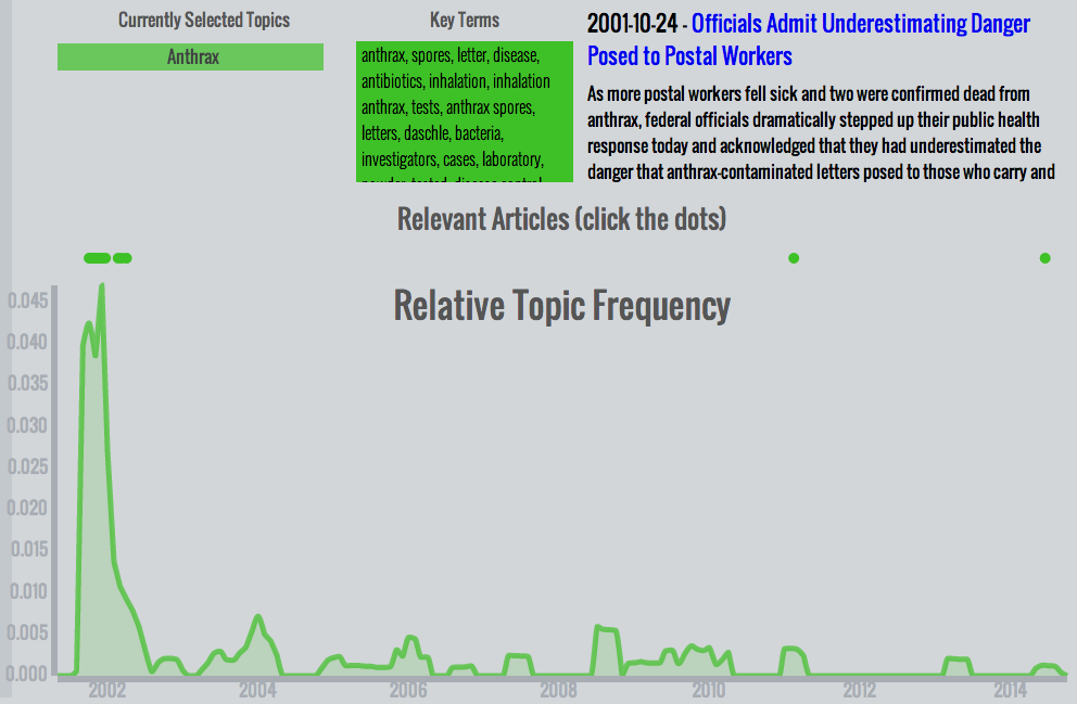
- Anthrax - After 9/11, a climate of fear took hold in the country. Fortunately, many of those fears were unfounded. The anthrax scare of late 2001 was an isolated incident without much lasting effect, as can be clearly seen in this plot.
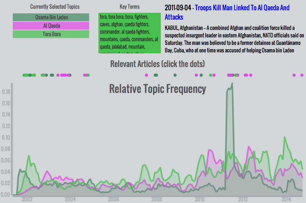
- Osama bin Laden, Al Qaeda, Tora Bora - The largest spike in any topic occurs after bin Laden was hunted down in Abbottabad in 2011. This combination of topics is notable because it shows the progression of media coverage immediately after 9/11: First, Osama bin Laden received the bulk of the attention. Soon after, the Tora Bora topic became prominent for being the presumed location of bin Laden's hideout and the focus of America's military attention. When it became apparent that bin Laden had evaded capture, both topics decreased in prominence while the broader Al Qaeda topic rose slightly. The gradual increase in each topic in recent years speaks to their continued relevance. Even without an absolute increase in coverage, their relative frequency increased as other topics fell away.
What I Learned
While I came out of the project with a fuller understanding of topic modeling and each other component of the complete data pipeline, the true value of the project was in the stories it (re-)told. The nature of 9/11 is fundamentally negative, but there were many positive stories: of heroes who saved many lives, of communities coming together, and of rebuilding.
Unfortunately, what emerged in my topic model reflects the larger media climate: a focus on negativity, villains, and destruction. Sure, individual heroes were honored in an article or two, but none were covered enough to become a topic. On the other hand, villains like Osama bin Laden and Zacarias Moussaoui were mentioned in hundreds or thousands of articles. Even Richard Reid, the bumbling (attempted) shoe bomber, had a more lasting impact in the media than successful heroes (a side note: one of the weaknesses of the term-focused topic model is that common names like Reid can lead to articles about very different people to be clustered together. In this case, Harry Reid and Richard Reid.).

Dan Morris is a professional poker player and coach turned data scientist, data engineer, and engineering manager. His specialties include: graph modeling, entity resolution, Spark data pipelines, deploying machine learning models to production, managing the intersection of science and engineering.
SHARE
Other posts you might be interested in


Subscribe to the Domino Newsletter
Receive data science tips and tutorials from leading Data Science leaders, right to your inbox.
By submitting this form you agree to receive communications from Domino related to products and services in accordance with Domino's privacy policy and may opt-out at anytime.